I was approached to bring the idea and concept of connecting culture through healthy snacks to life with an app for a bakery business.
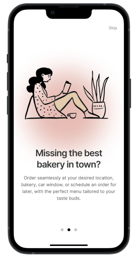
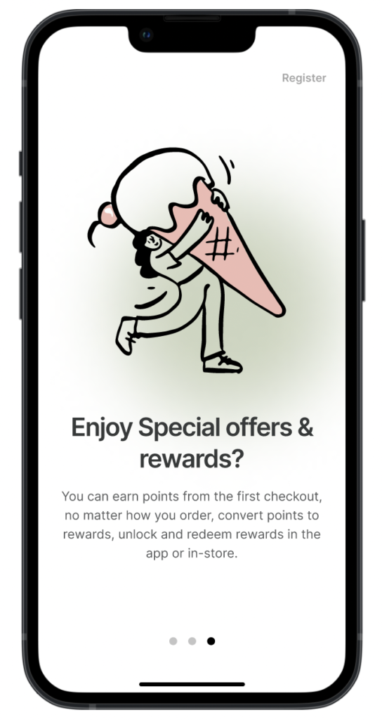
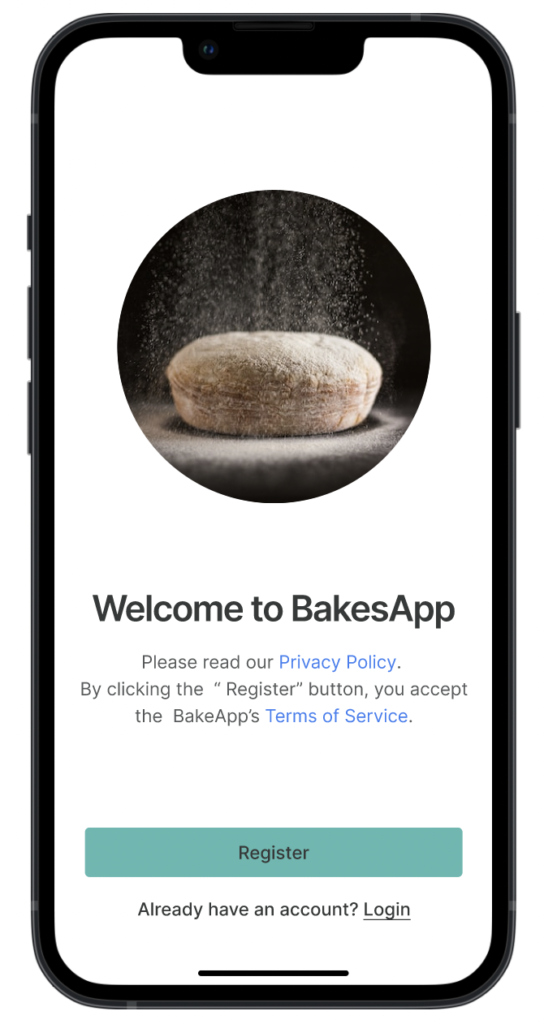
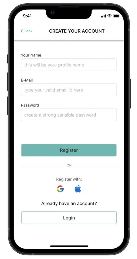
Introducing a Bakery App, a delightful platform designed to make a bakery experience seamless and enjoyable. As a UX designer, I was challenged to create an intuitive and user-friendly solution for customers to order baked goods and pastries online. In this project, I followed a systematic design process to ensure that the app meets the needs and expectations of its users. Here are the steps I personally followed to bring this project to life:
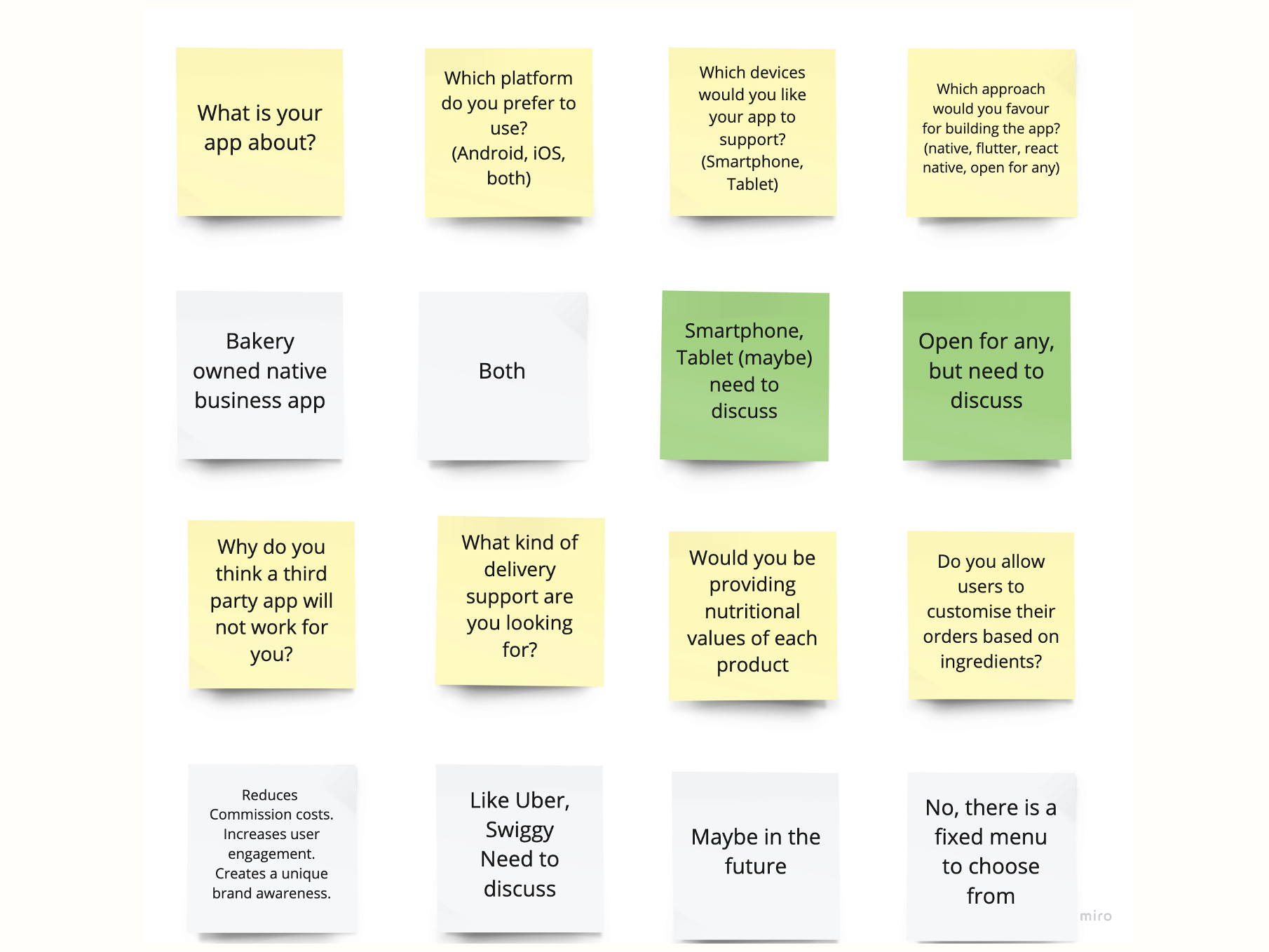
SCREENSHOT OF A PART OF MY MIRO BOARD
REQUIREMENT GATHERING
Collaborated with the client using Miro board to understand the business goals. The original requirements of the client are as follows:
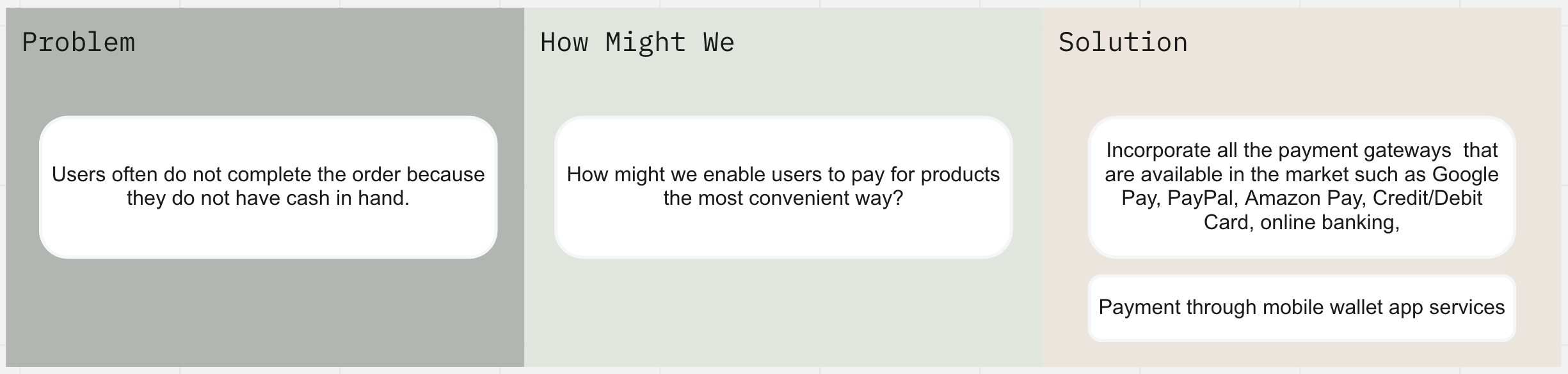
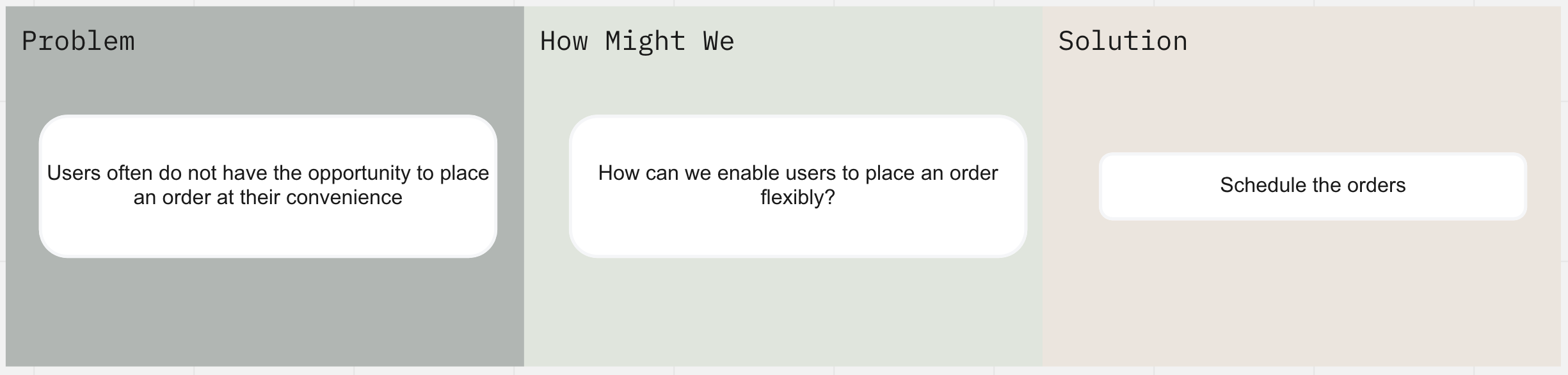
Steps should be as easy and seamless while placing the order.
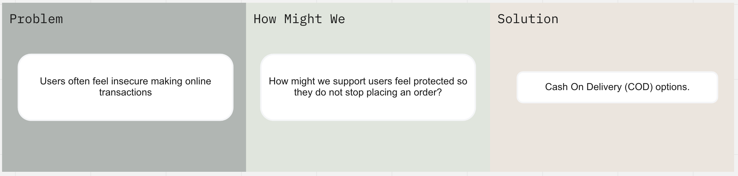
Food must be delivered, but there is no dedicated delivery team on the company payroll.
The design of the app should be aesthetically pleasing with clear and tempting product pictures.
SUMMARY OF MY RESEARCH
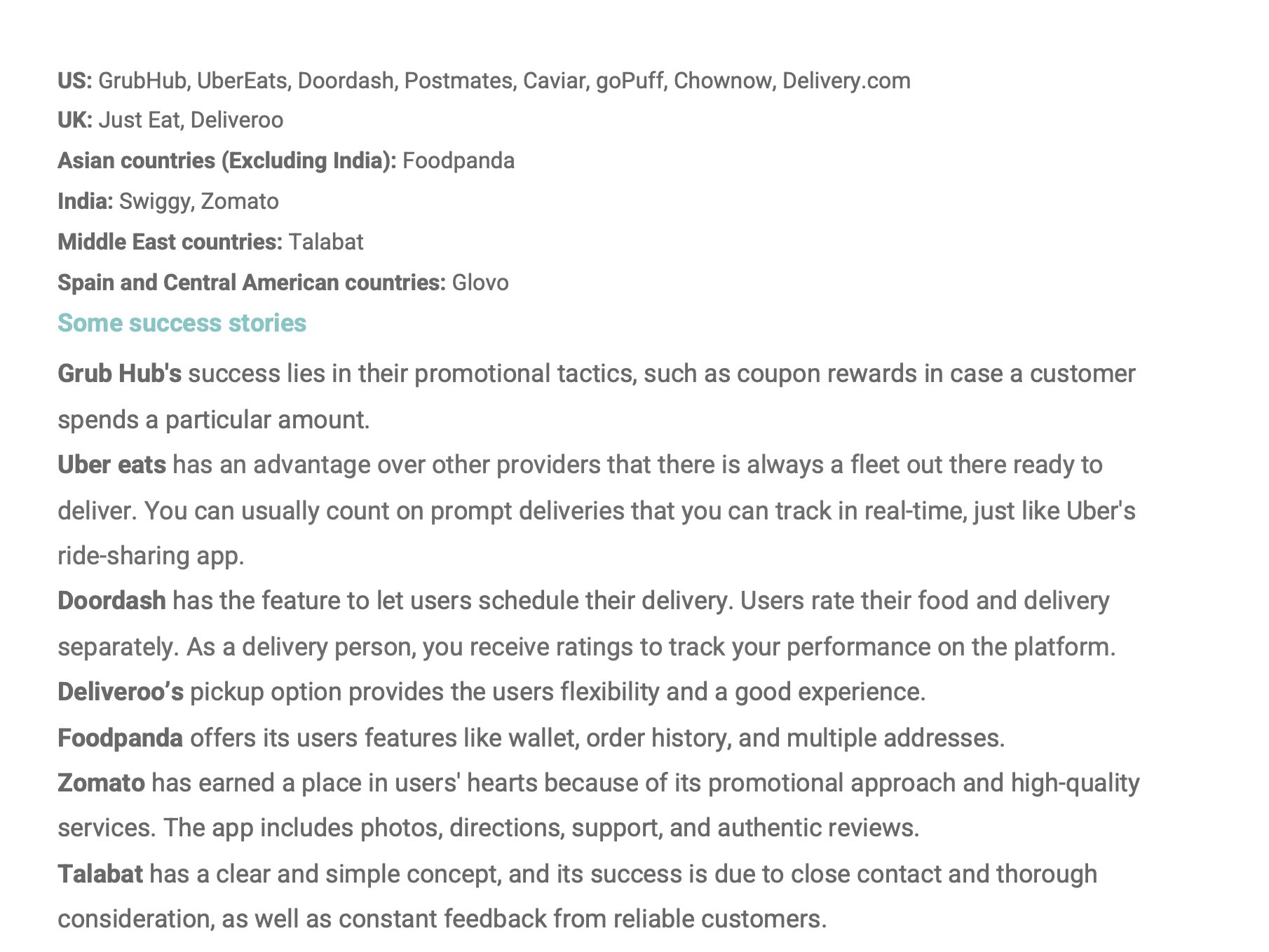
insights from COMPETITIVE RESEARCH
Looked at some of the leading food delivery apps to understand their business model.
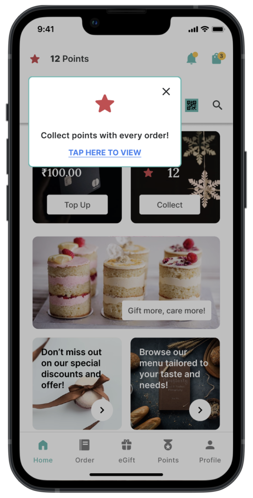
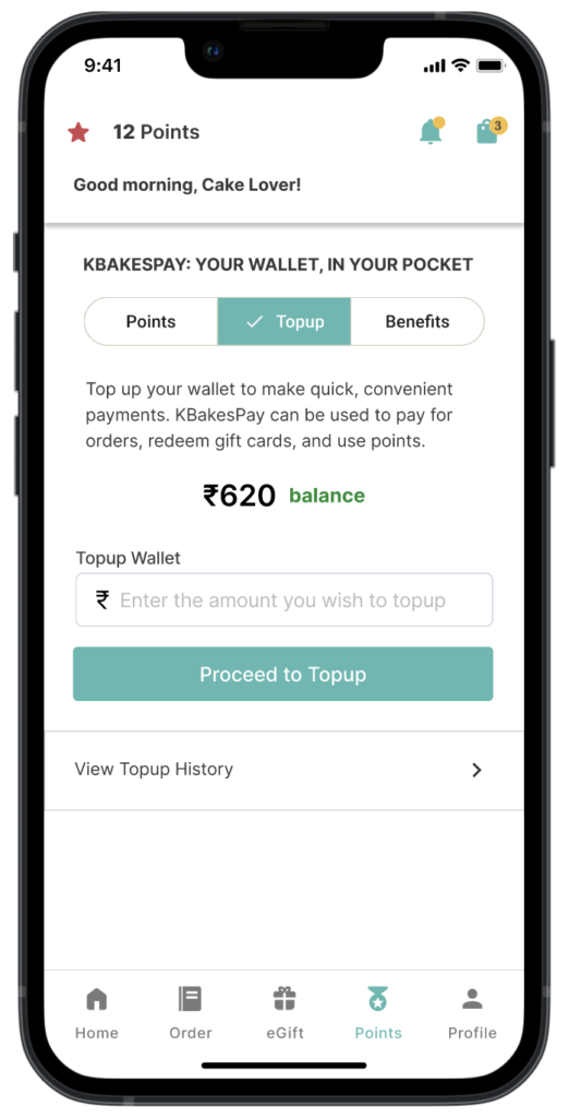
A wallet system can make the app effective and appealing, and a reward system can motivate users.
Constant contact with real users and their feedback can create a place in the users’ heart.
Delivery integration is a critical factor as it plays an important role in providing users with a great experience, along with providing tasty food, classic cooking methods, high-quality food, fresh food at reasonable prices.
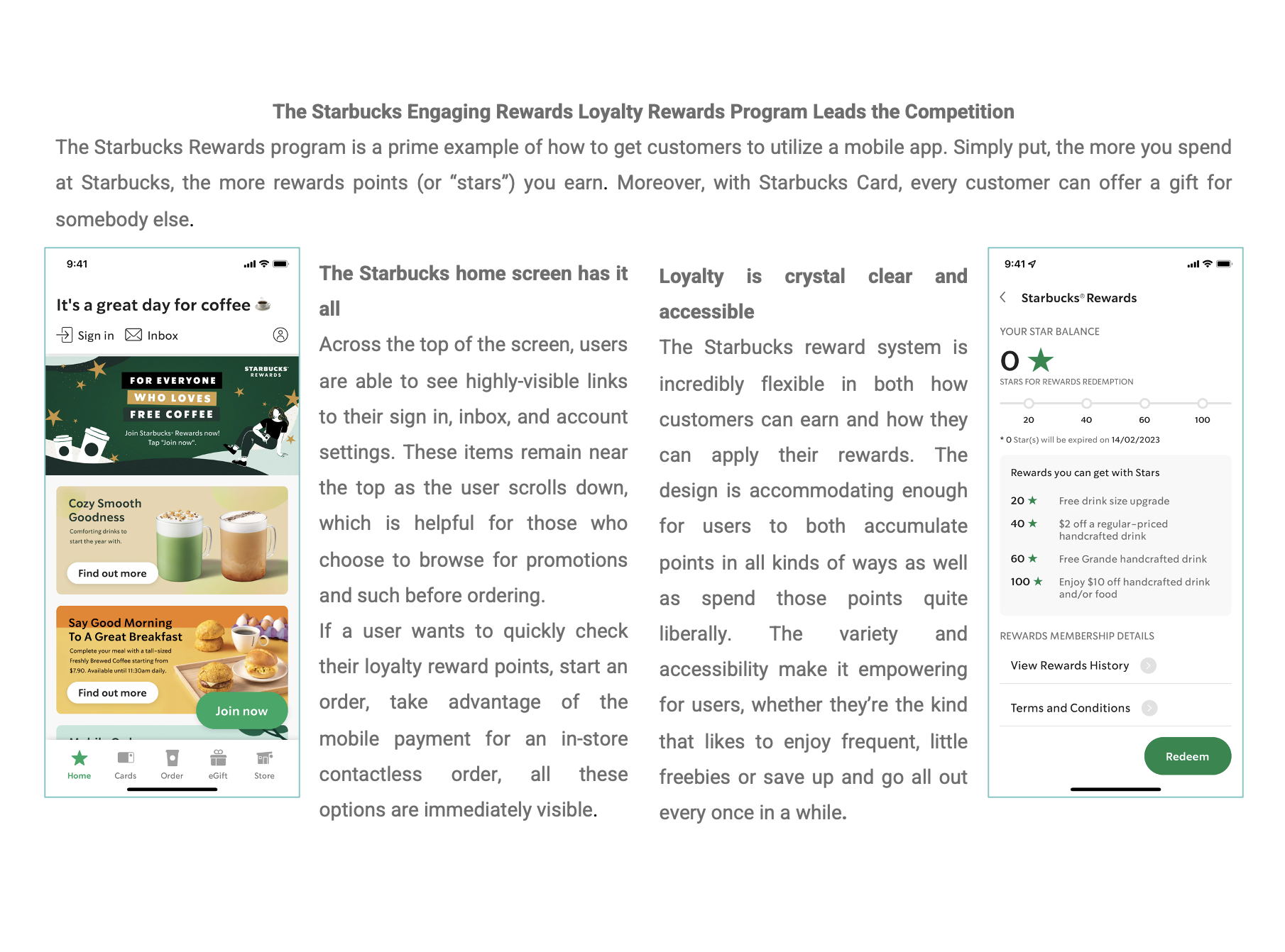
INVESTIGATED STARBUCKS'S DESIGN SOLUTIONS
insights from COMPETITIVE ANALYSIS 1
Looked at how Starbucks has notched up its success with a mobile app.
A loyalty program with a good design and accessible rewards almost always yields substantial engagement and retention.
Reward systems, like anything that can be gamified whether it’s meant to be or not, play nicely with user psychology which will almost certainly lead to more spending.
An app should not be just a digital extension of a bakery’s menu.
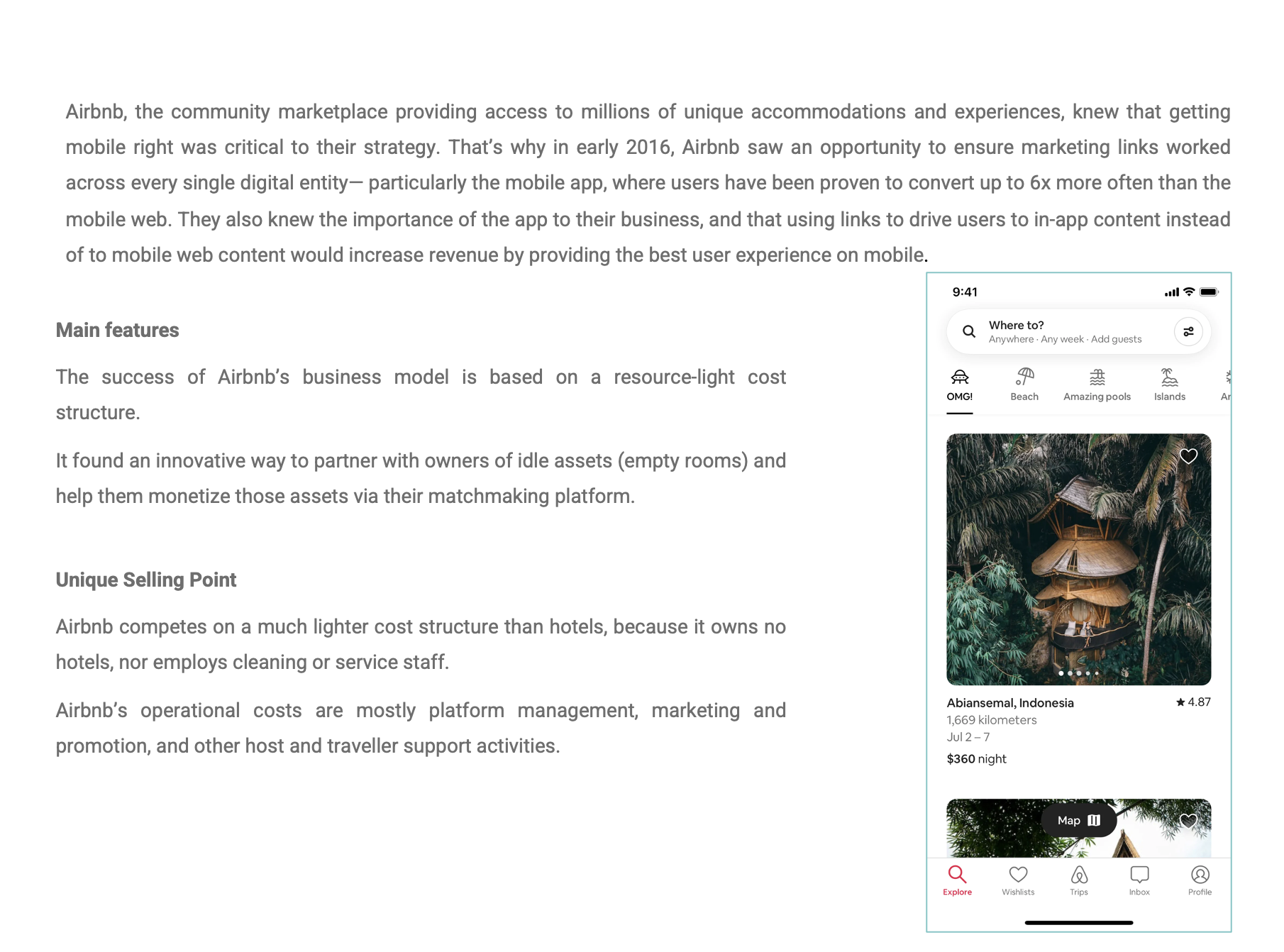
INVESTIGATED AIRBNB'S DESIGN SOLUTIONS
insights from COMPETITIVE ANALYSIS 2
Looked at how a non-food business has notched up its success with a mobile app
For the hosts (third-party delivery team), the app provides an opportunity to earn additional income.
For the users (customers placing orders), it is a way to conveniently find unique nostalgic snacks at lower prices.
For the bakery owner, it eliminates the burden of direct food delivery.
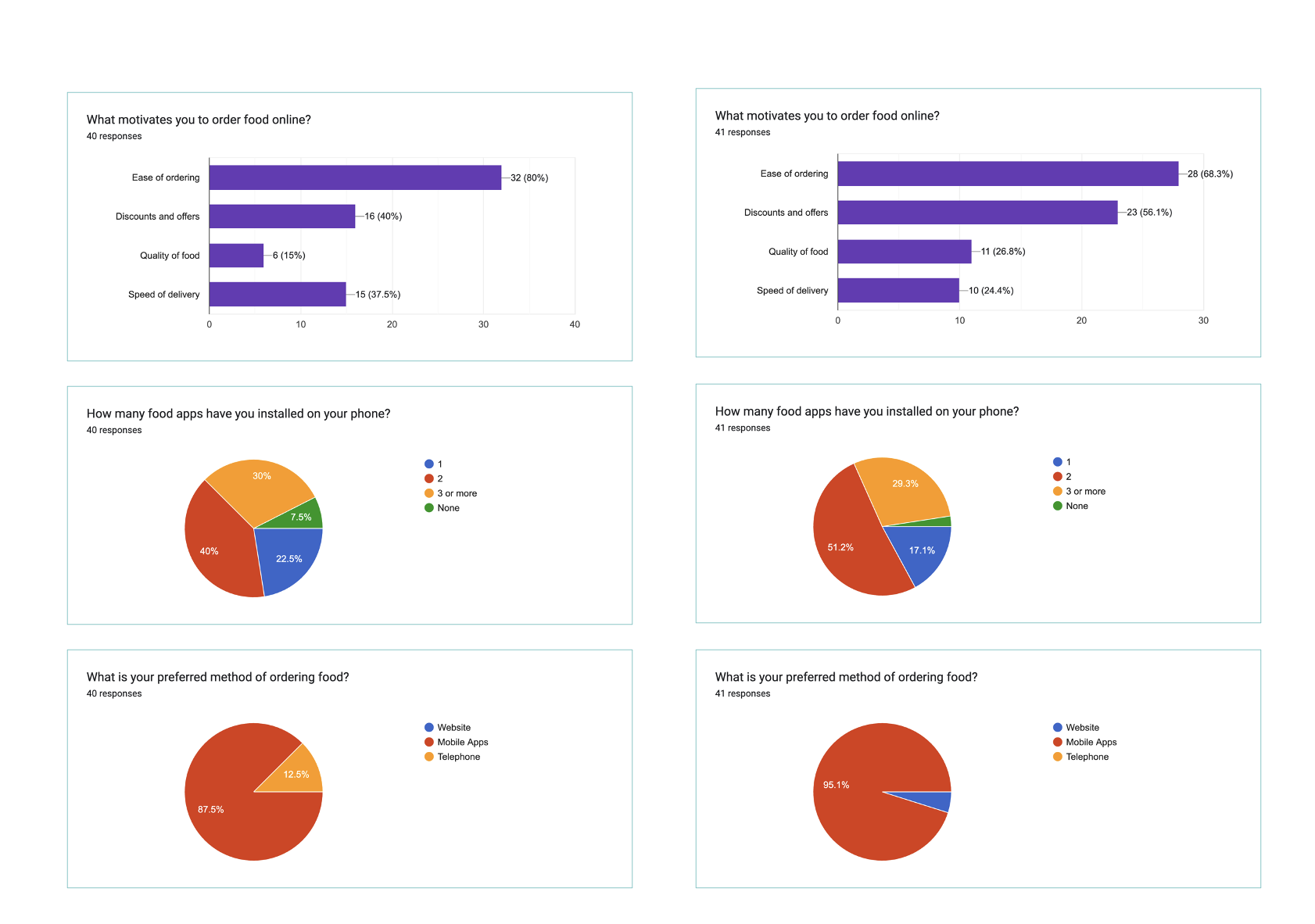
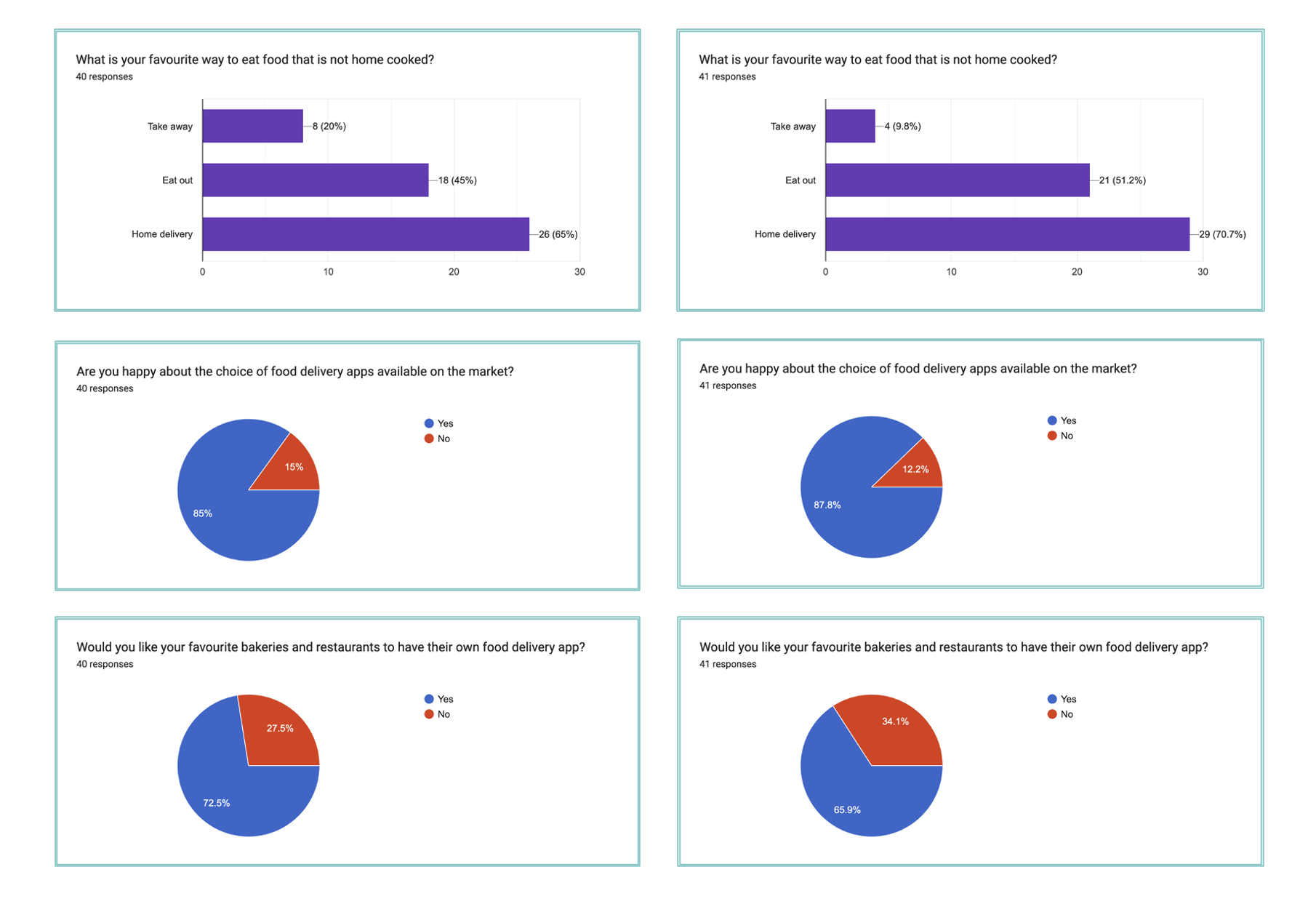
USER SURVEY RESULTS
insights from USER SURVEY
Conducted a survey of two different user groups
Type 1 : Widespread users of food apps (living in a metro city).
Type 2 : Users with fewer options (current audience living in a small town).
Goal: To understand how their problems, attitudes, and preferences differ in different context.
Key findings from the survey
Users are always looking for a simple and easy design with better control and freedom.
Since users are already familiar with food apps, they don’t have to get used to a new system or rely heavily on memory to navigate interfaces.
In this context, a mobile food app is least likely to fail if it is designed efficiently for users.
This is an interesting observation : Users are already satisfied with the available delivery apps, but still want their own bakery app, which is an indication that the company has the potential to make an emotional connection with users through the app, and that users would have a great experience with it.
HIGHLIGHTS OF USER INTERVIEW
insights from USER interview
Asked potential users questions to gain an understanding of their preferences, thoughts, and feelings and to validate my survey results and user patterns
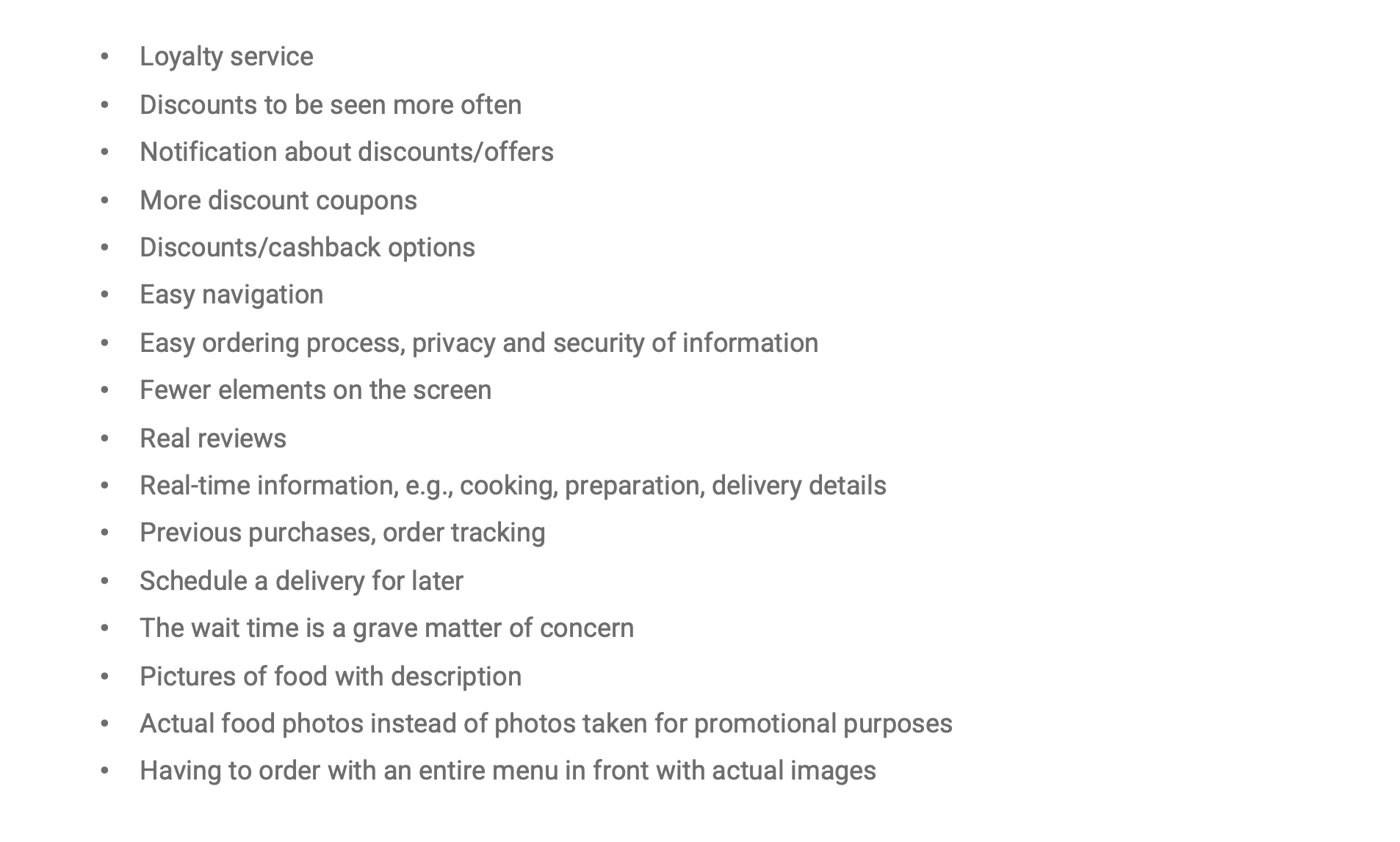
Discounts and offers would motivate loyal users.
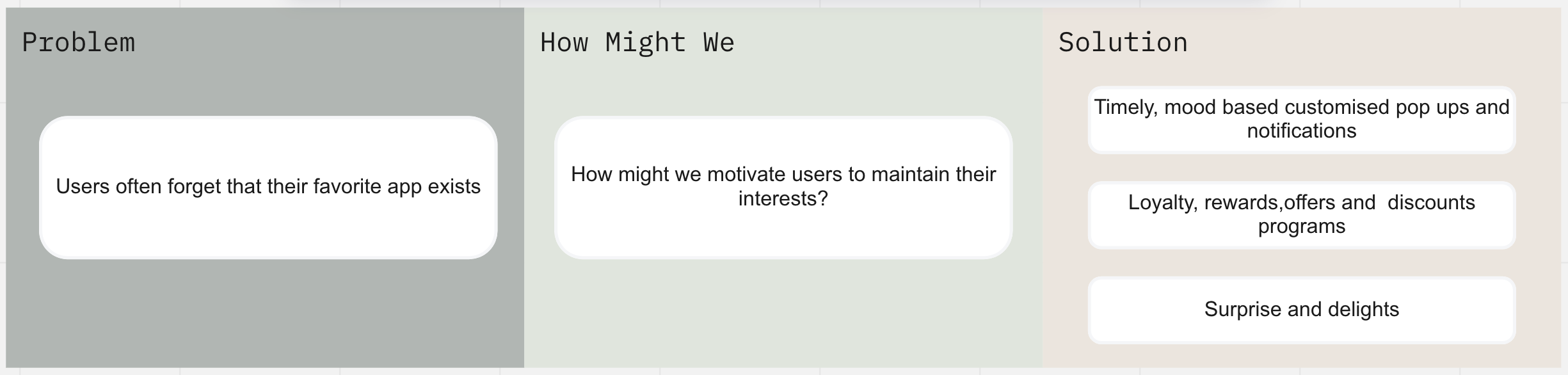
Notifications can remind users of menu updates and discounts.
The bakery can stay connected with users, engage them and build a bond and trust through frequent feedback and reviews.
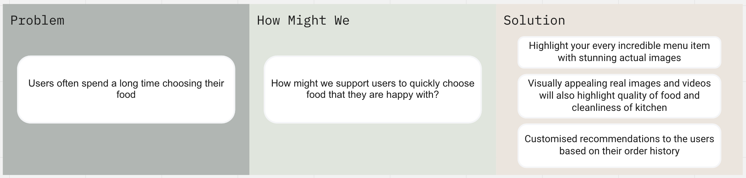
Real-time images and videos increase the curiosity of users and thus the use of the app.
The logic of ordering food by each user is different. Mood based reminders, smart suggestions, emotional tracking play a very important role.
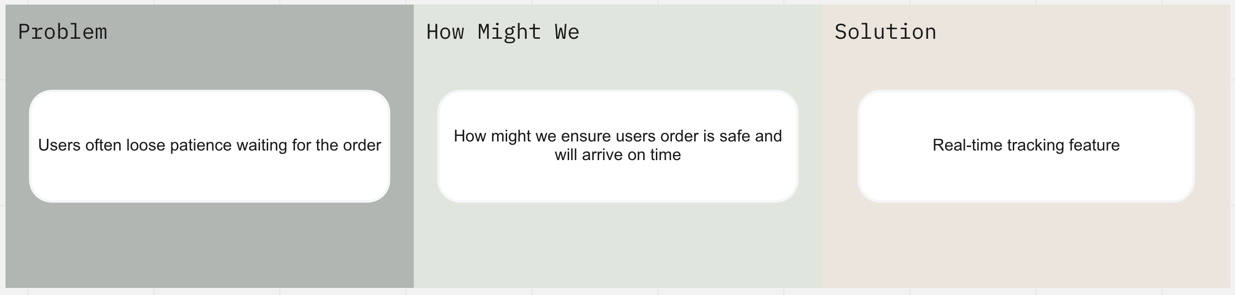
Timely food delivery directly impacts user confidence in your system.
PROBLEM STATEMENT
insights from SURVEY & interview
User survey and interviews gave me the confidence I needed to define the actual problem without making assumptions, taking into account the following observations:
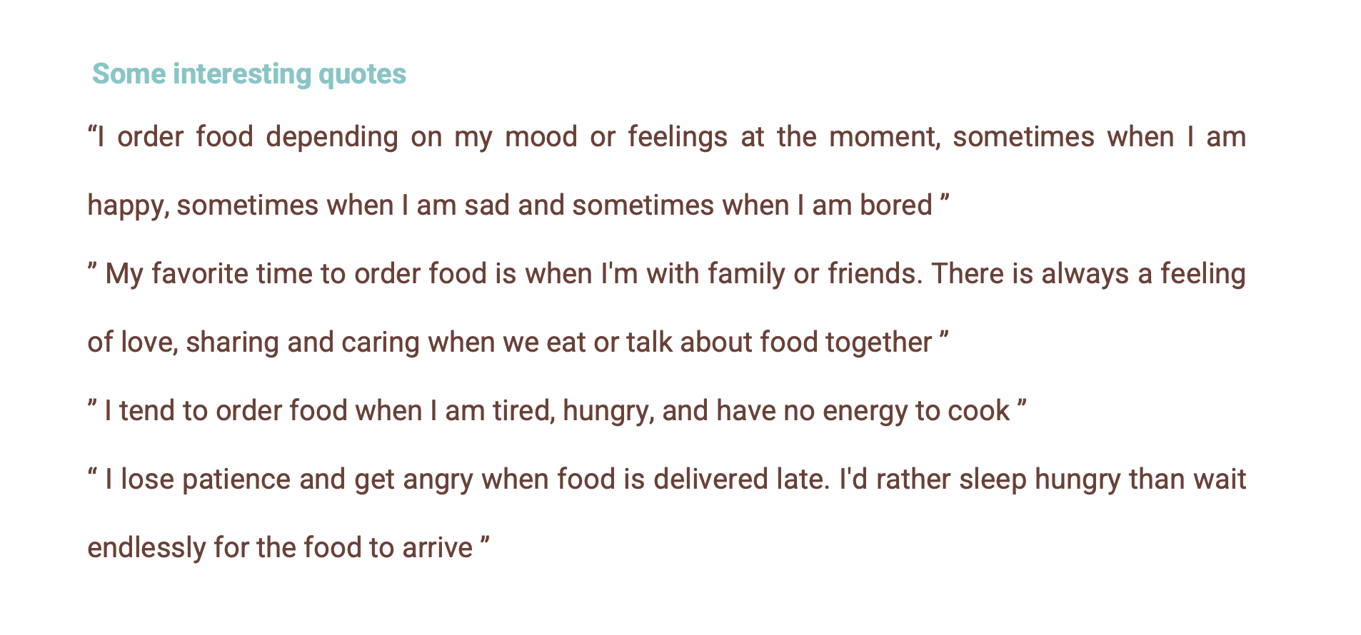
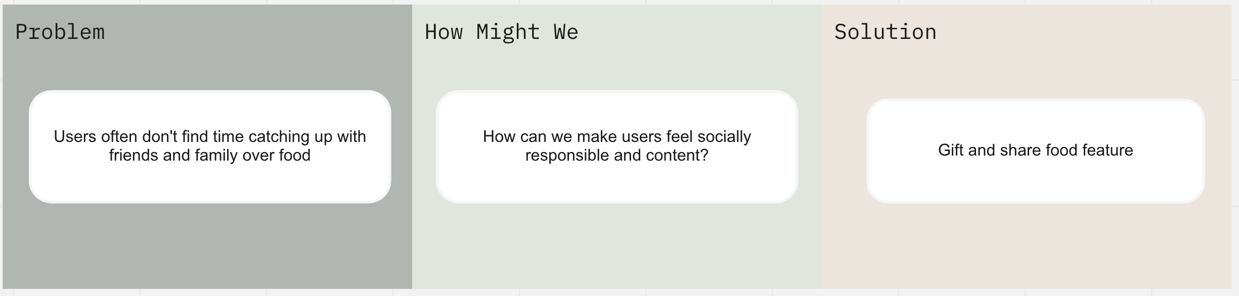
People use food as a social tool to share love and care with their family, friends or loved ones.
People use food as a coping mechanism to deal with many feelings in various situations such as stress, boredom or anxiety, or even to prolong feelings of happiness.
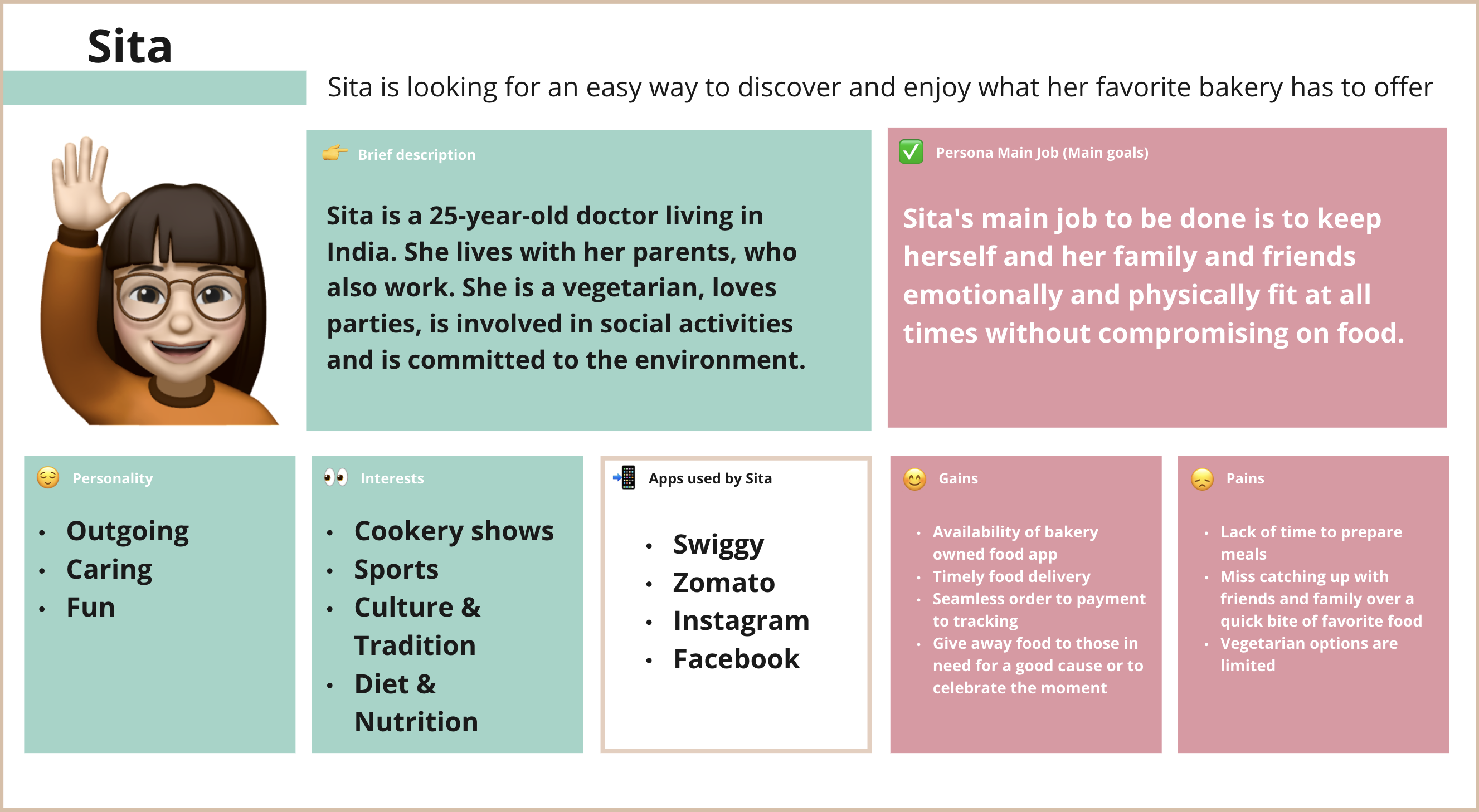
PERSONA TO REPRESENT GENERAL USERS
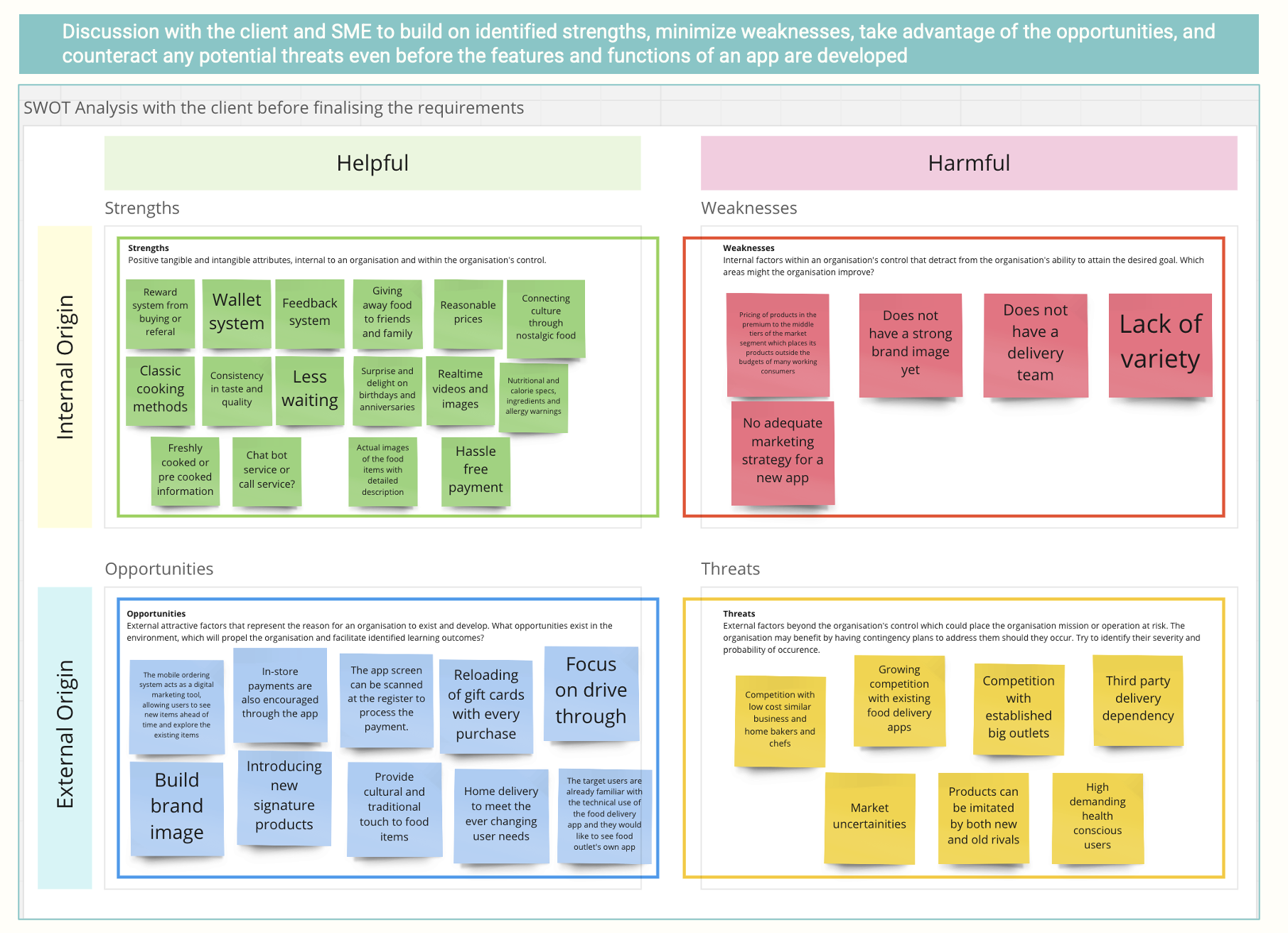
SWOT ANALYSIS BY COLLABORATING WITH THE CLIENT AND SME
Ideated solutions to problems identified so that users solve their problems intuitively and effortlessly
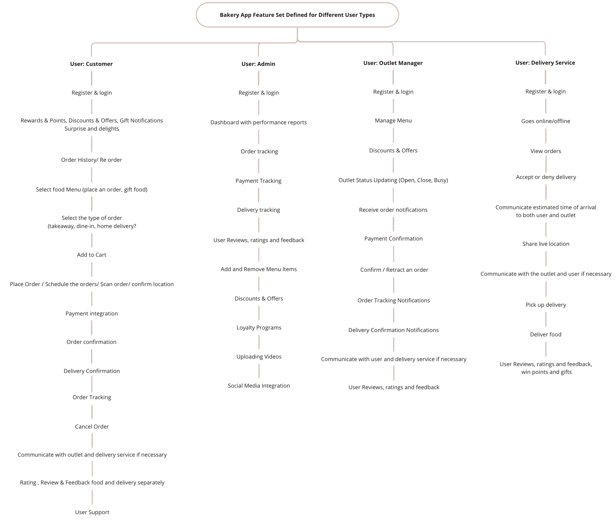
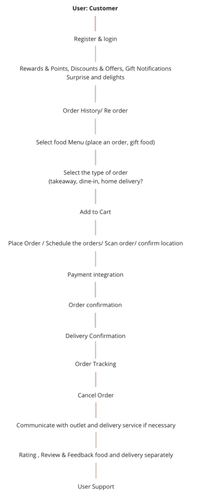
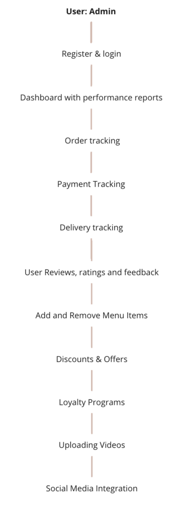
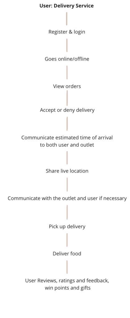
DEFINED FUNCTIONALITY AND FEATURES
A wonderful interface to the wrong features will definitely fail, and to avoid this, I have used all the insights gained so far to keep the right content and the right amount of content for each user type to understand user flows
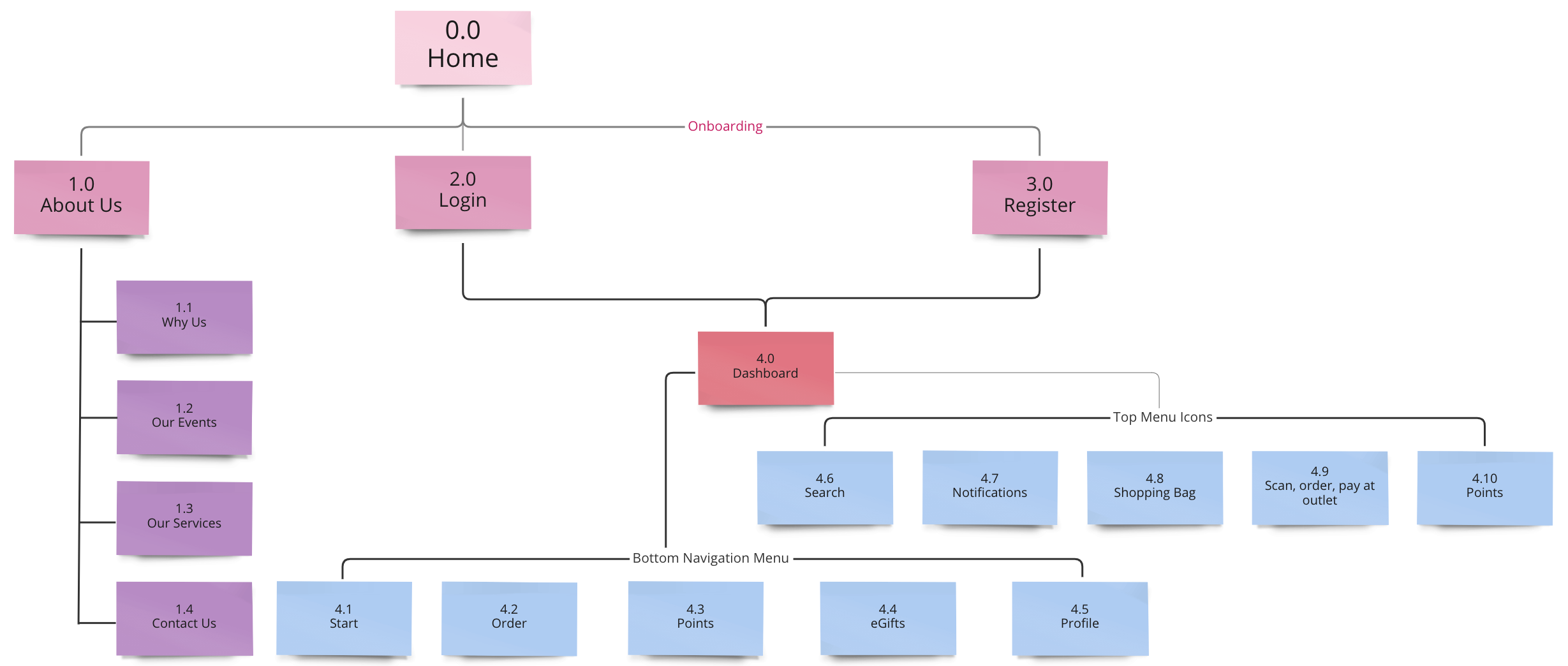
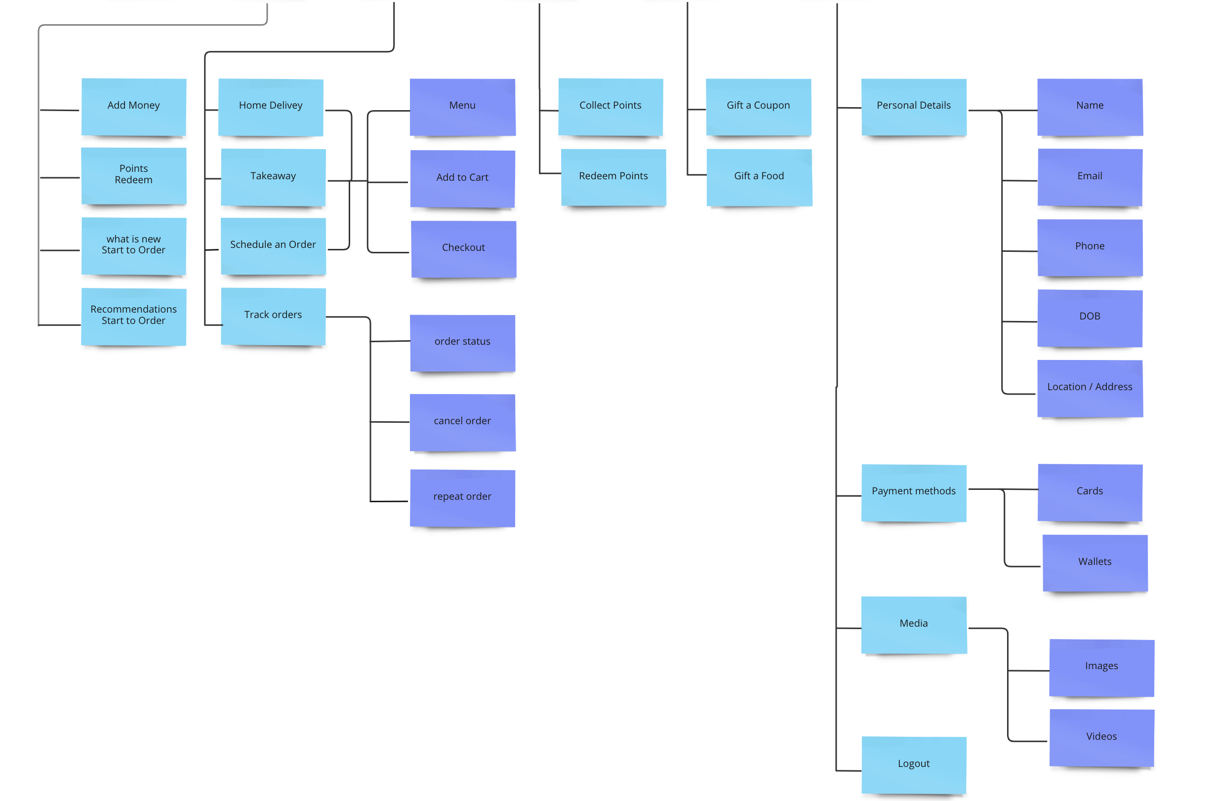
SITE MAP
Divided into the specific paths a user could take within my product to understand the navigation layout and hierarchy
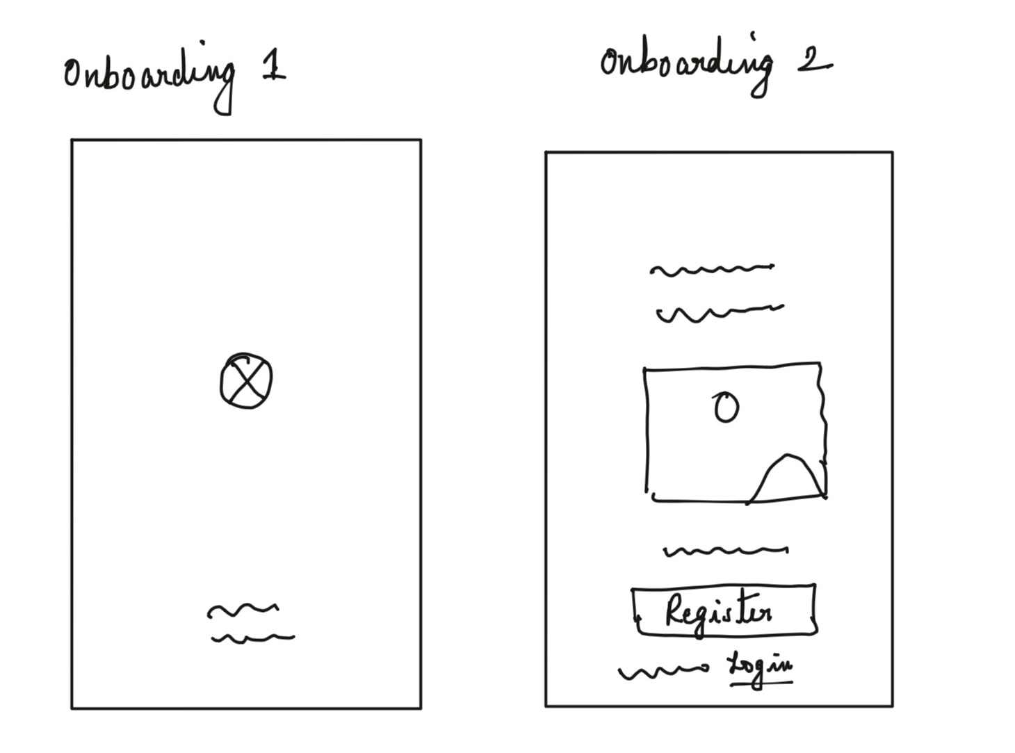
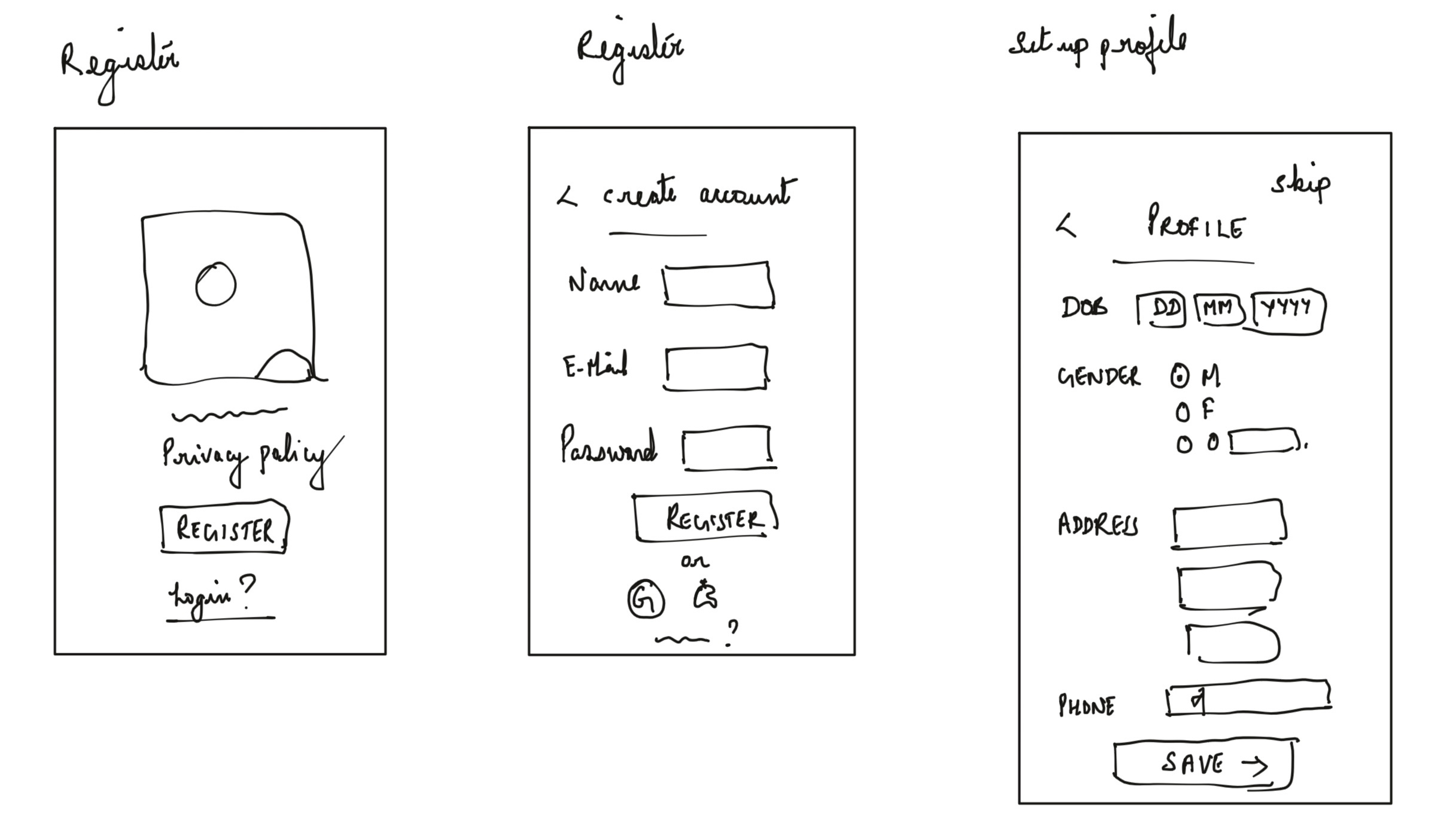
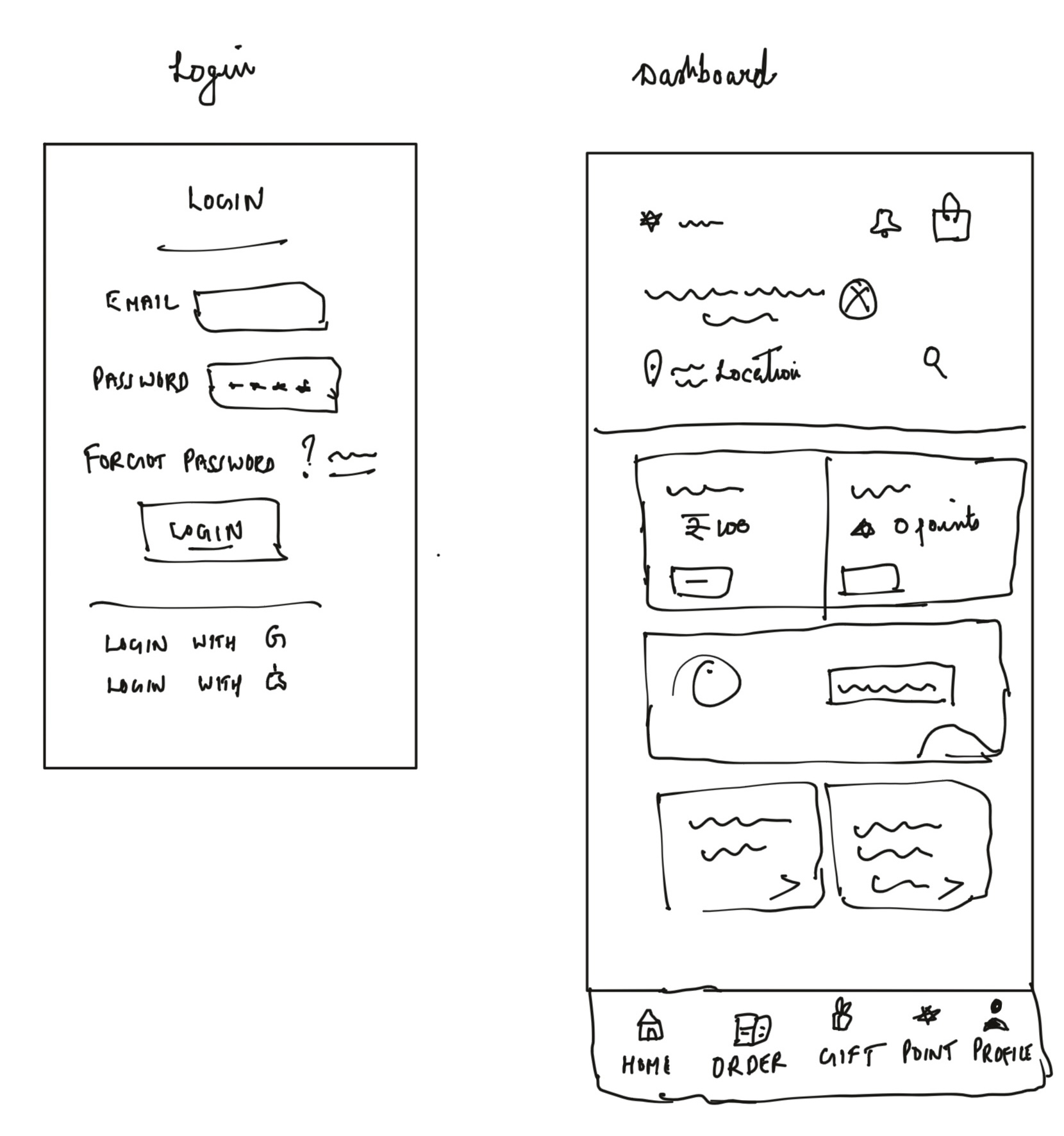
LOW FIDELITY SKETCHES
Combined some of my ideas into low-fidelity sketches
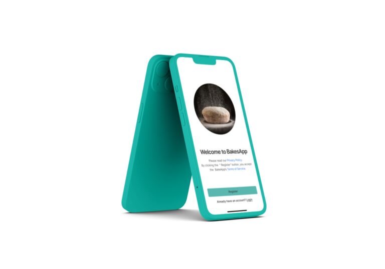
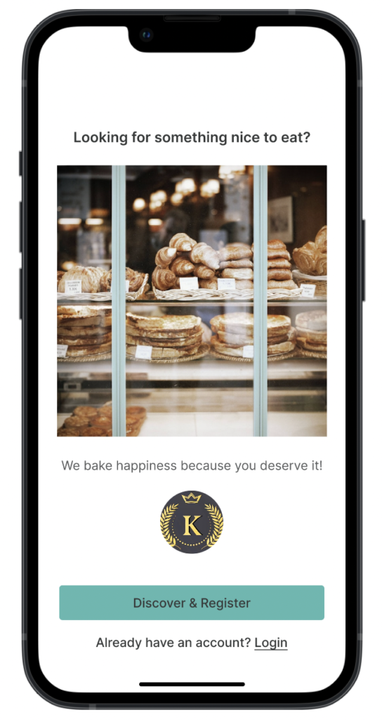
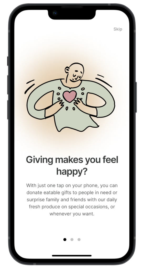
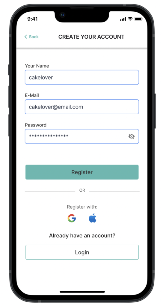
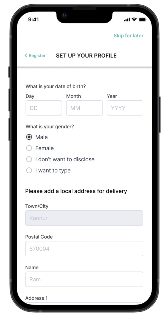
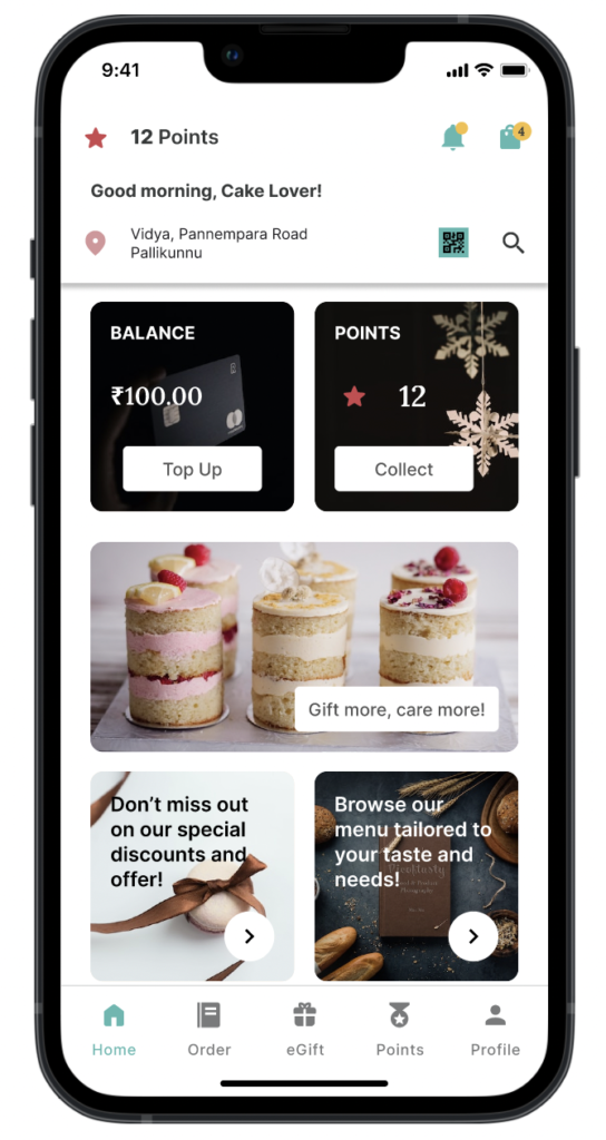
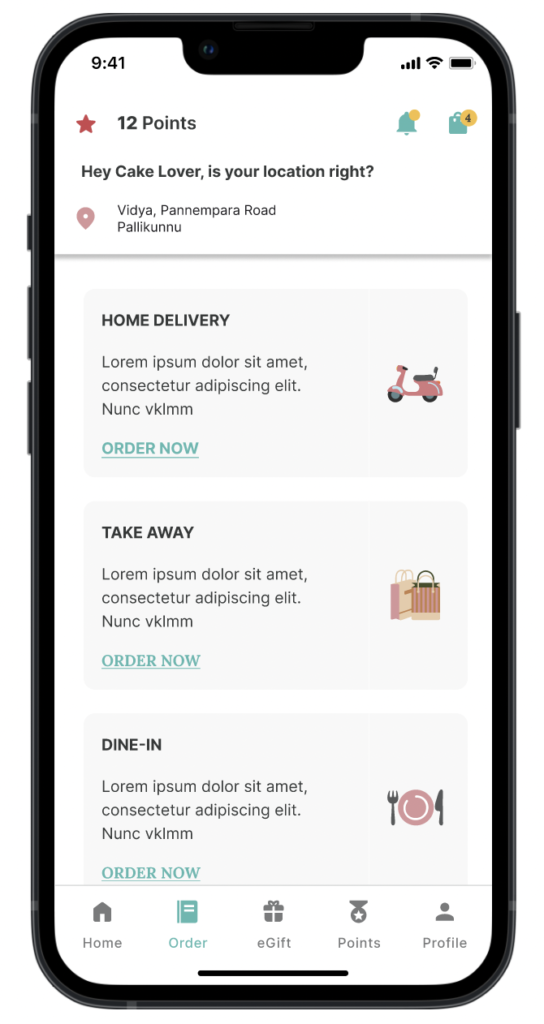
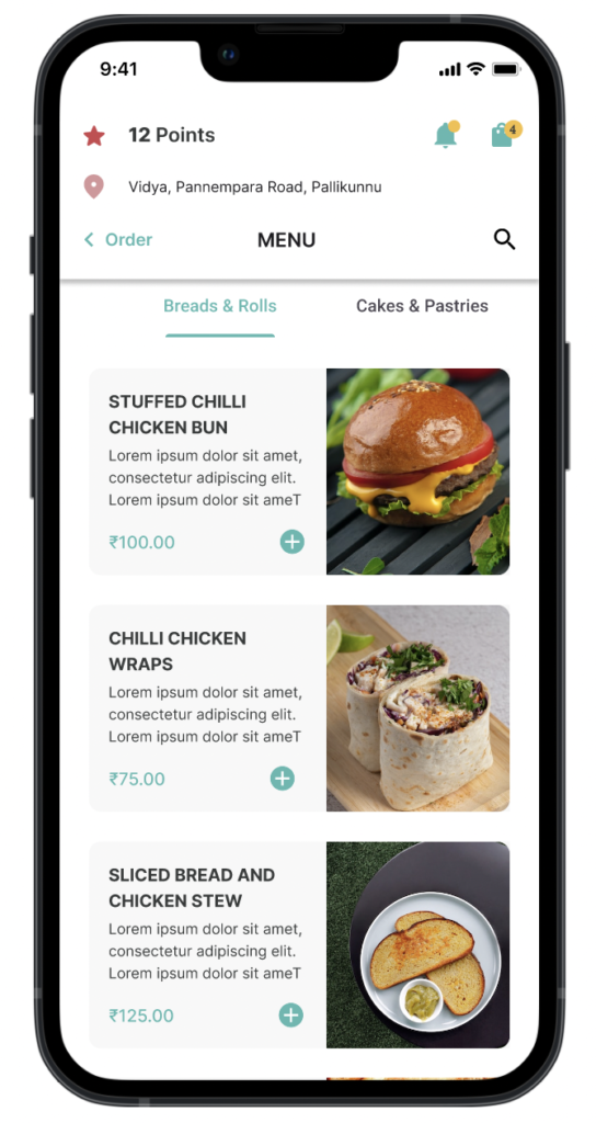
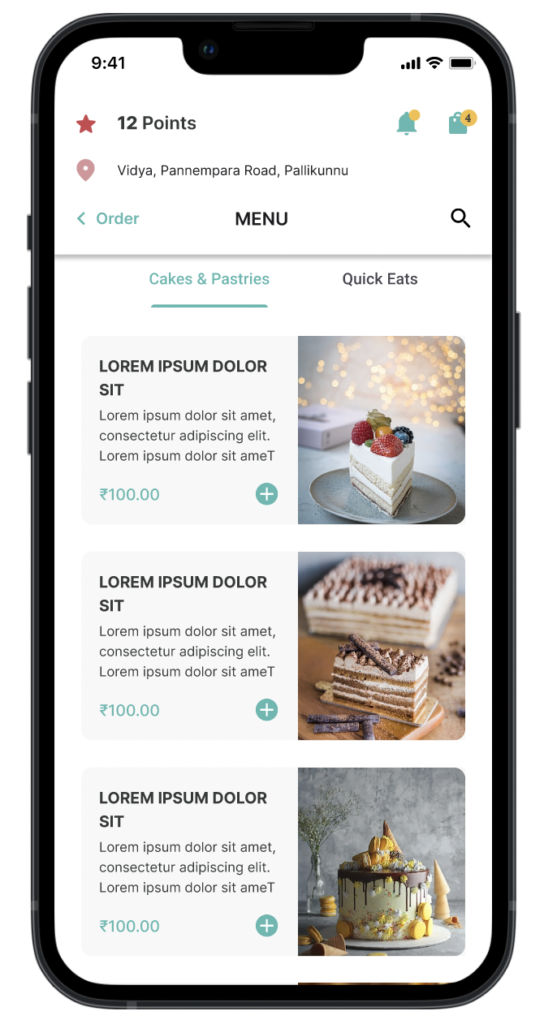
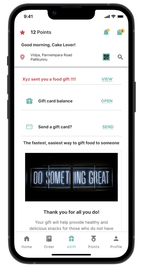
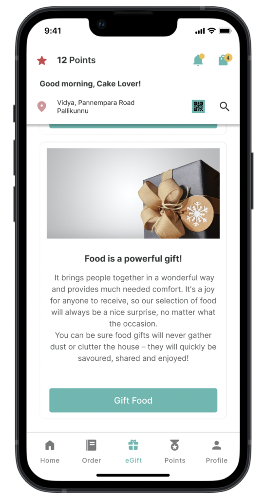
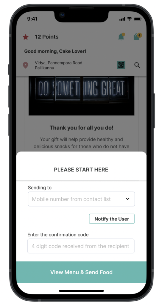
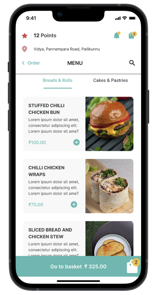
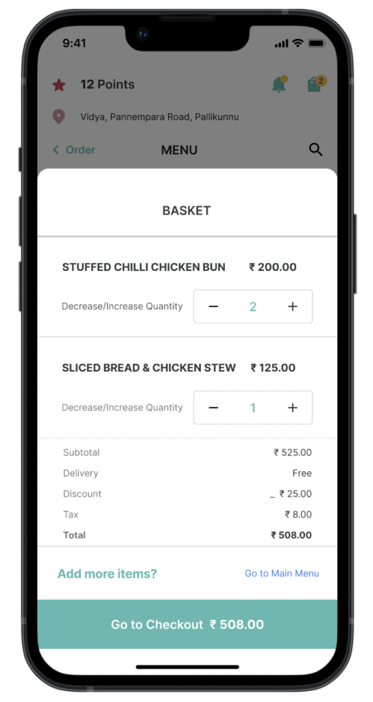
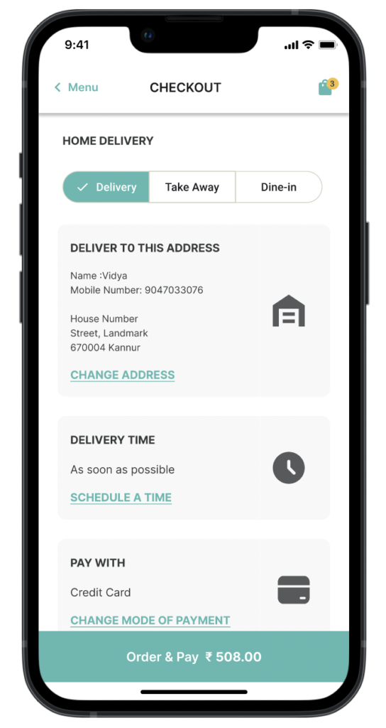
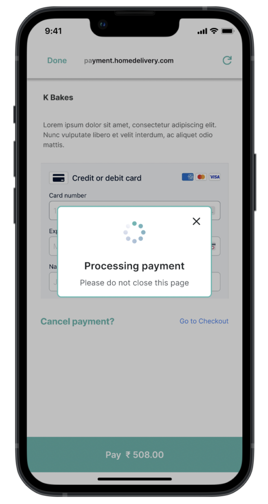
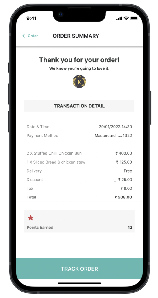
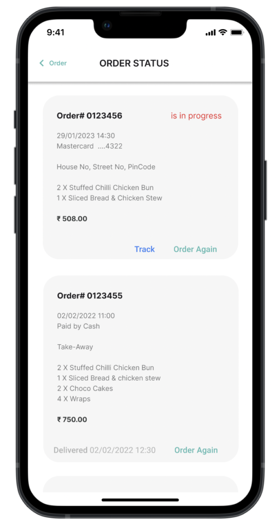
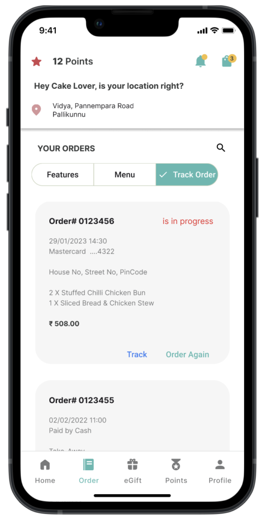
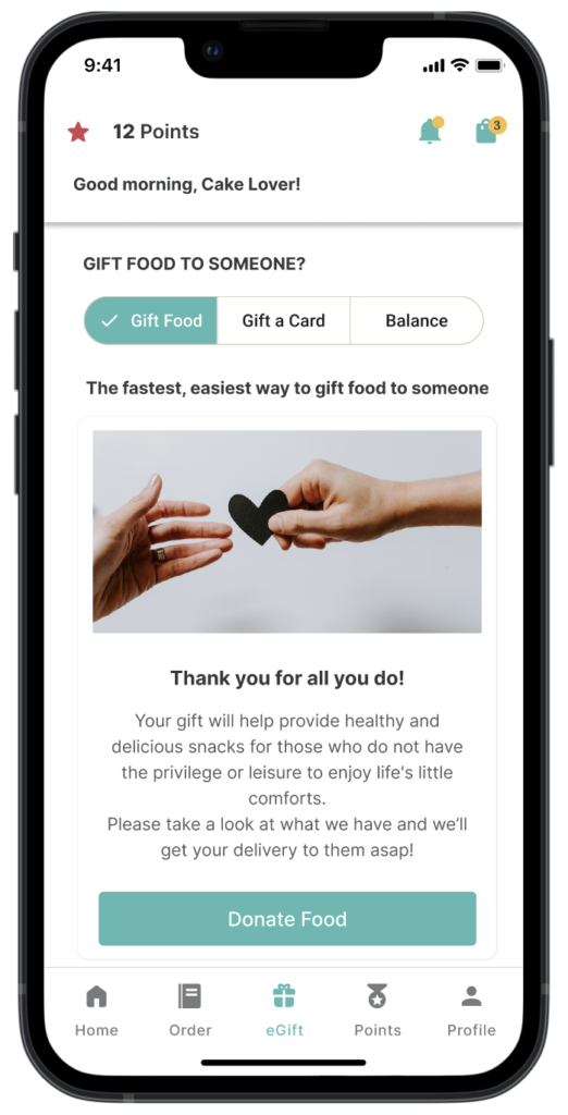
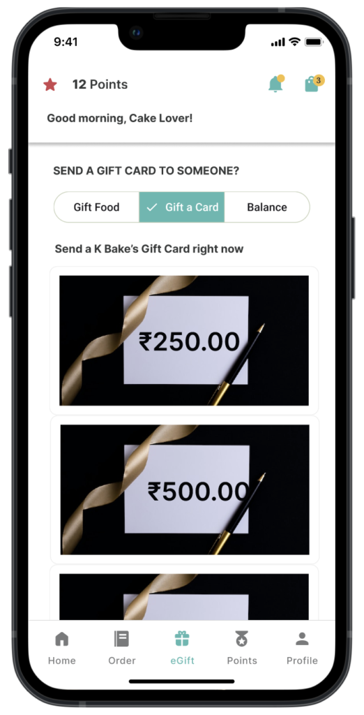
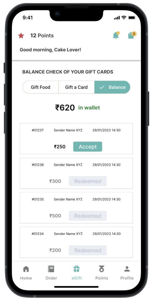
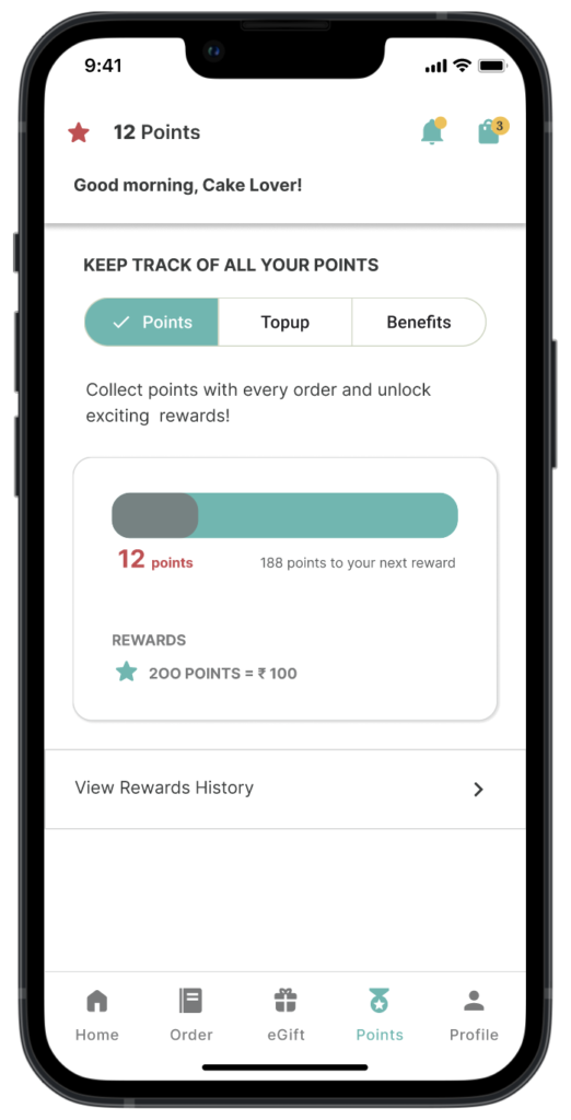
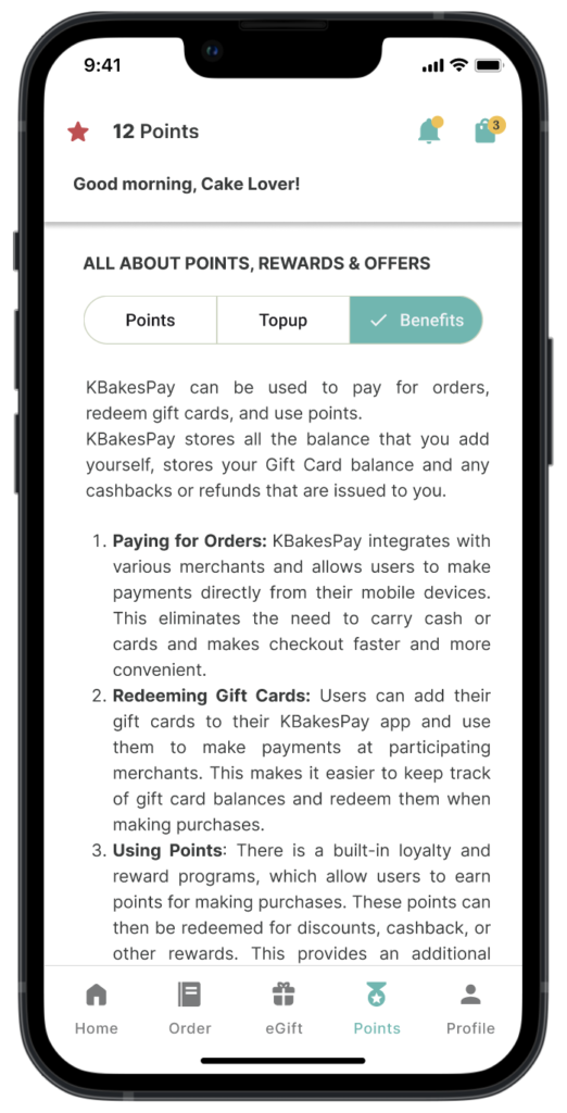
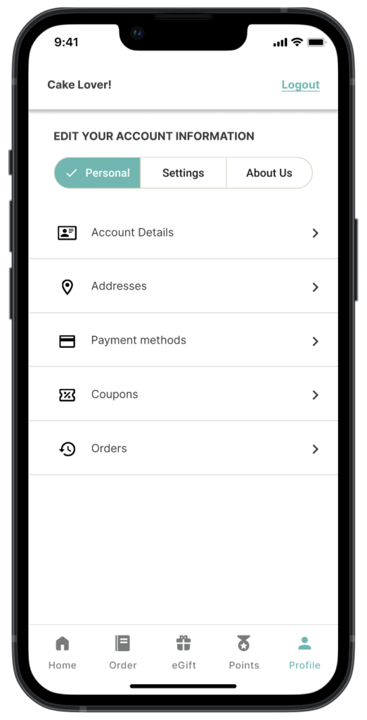
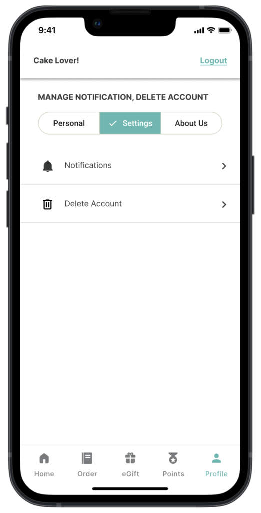
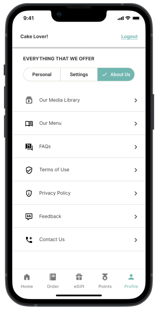
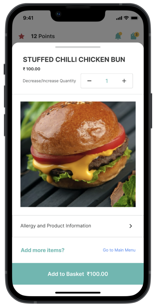
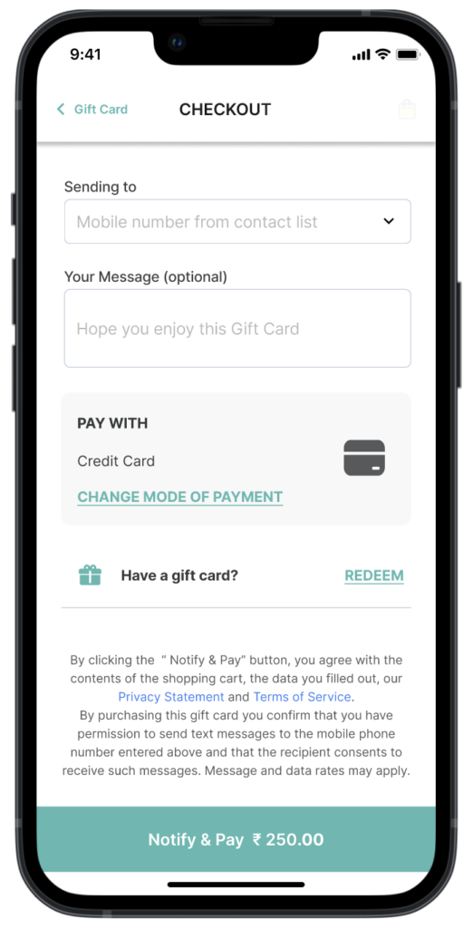
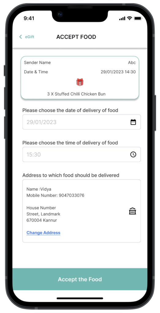
HIGH FIDELITY PROTOTYPES
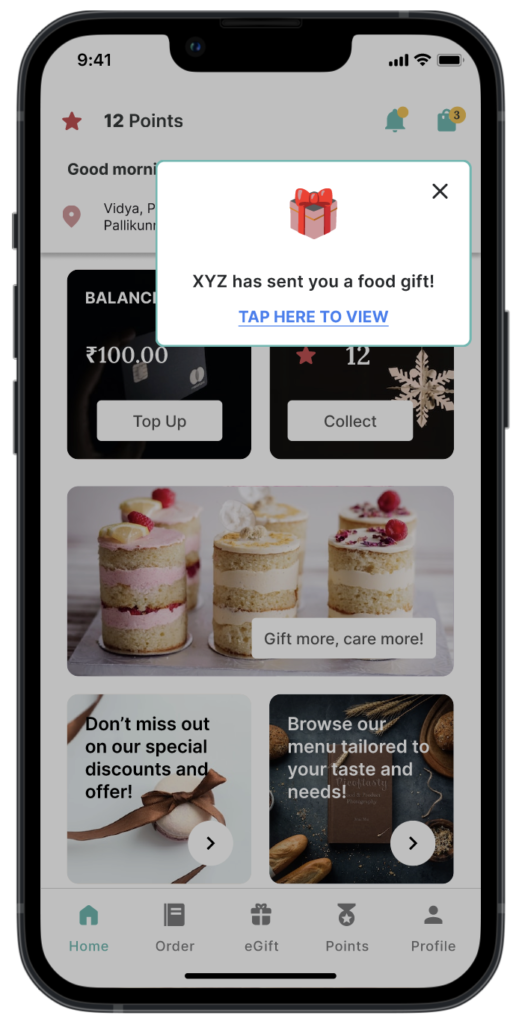
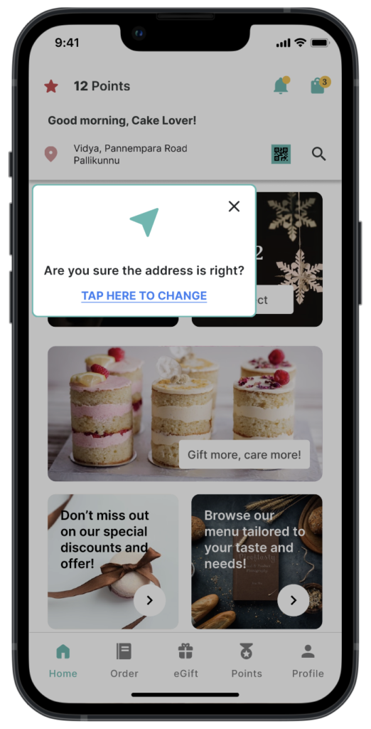
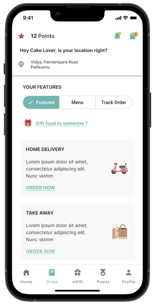
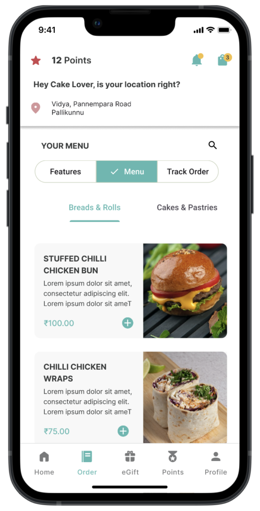
Some images for high fidelity prototypes using Figma
Refining the User Experience: An Ongoing Journey
The design process is never truly finished, as there is always room for improvement and refinement. This is how I improve upon my designs, ensuring that they meet the evolving needs of users and stakeholders.
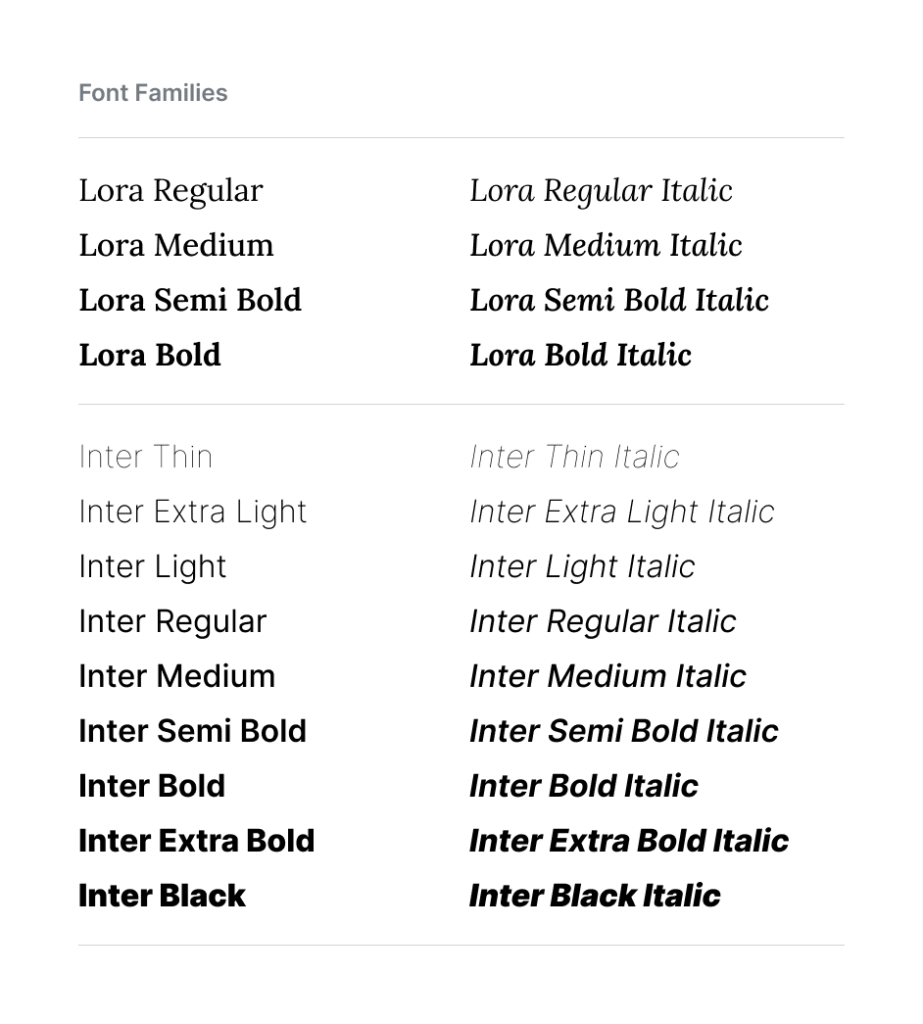
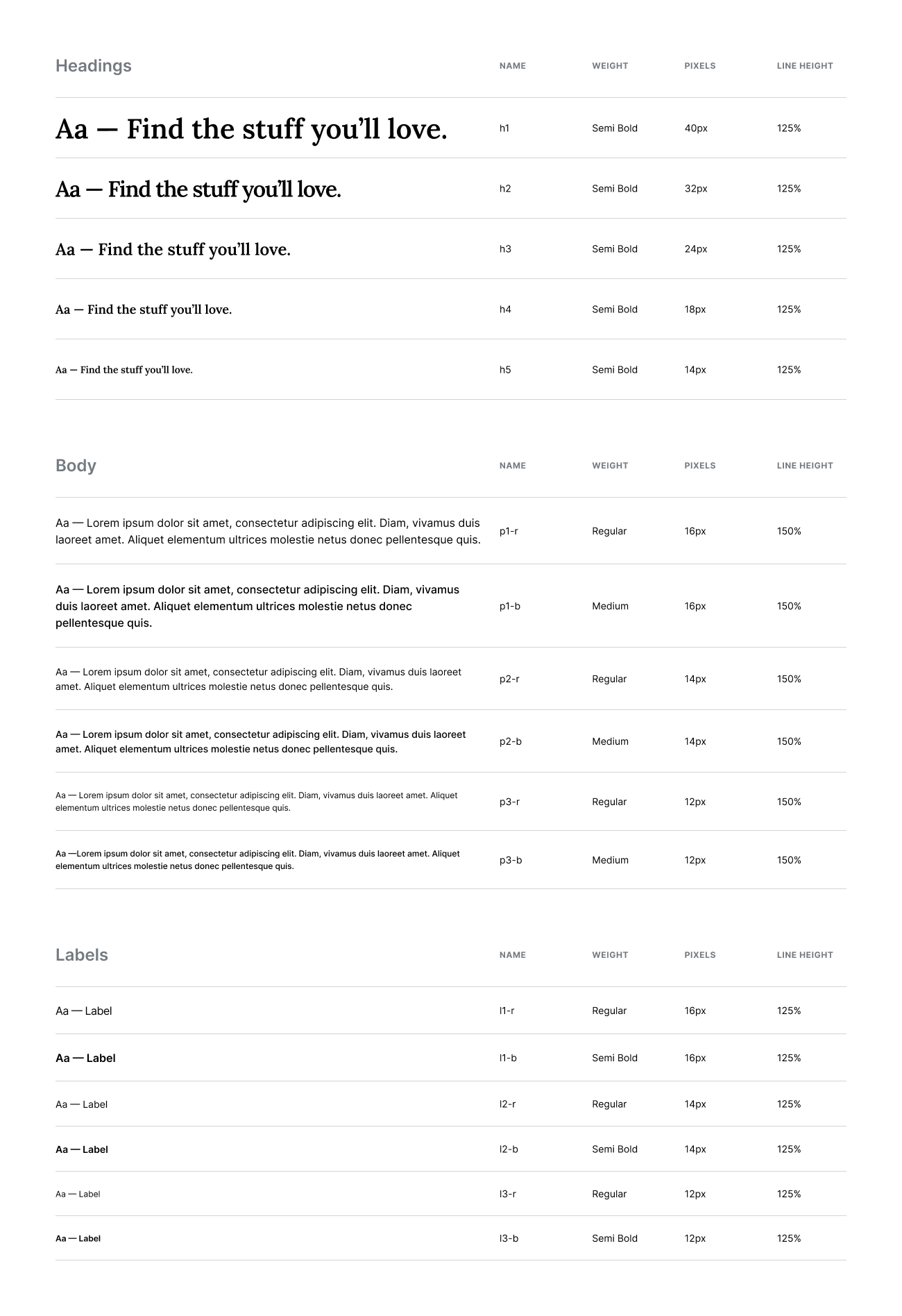
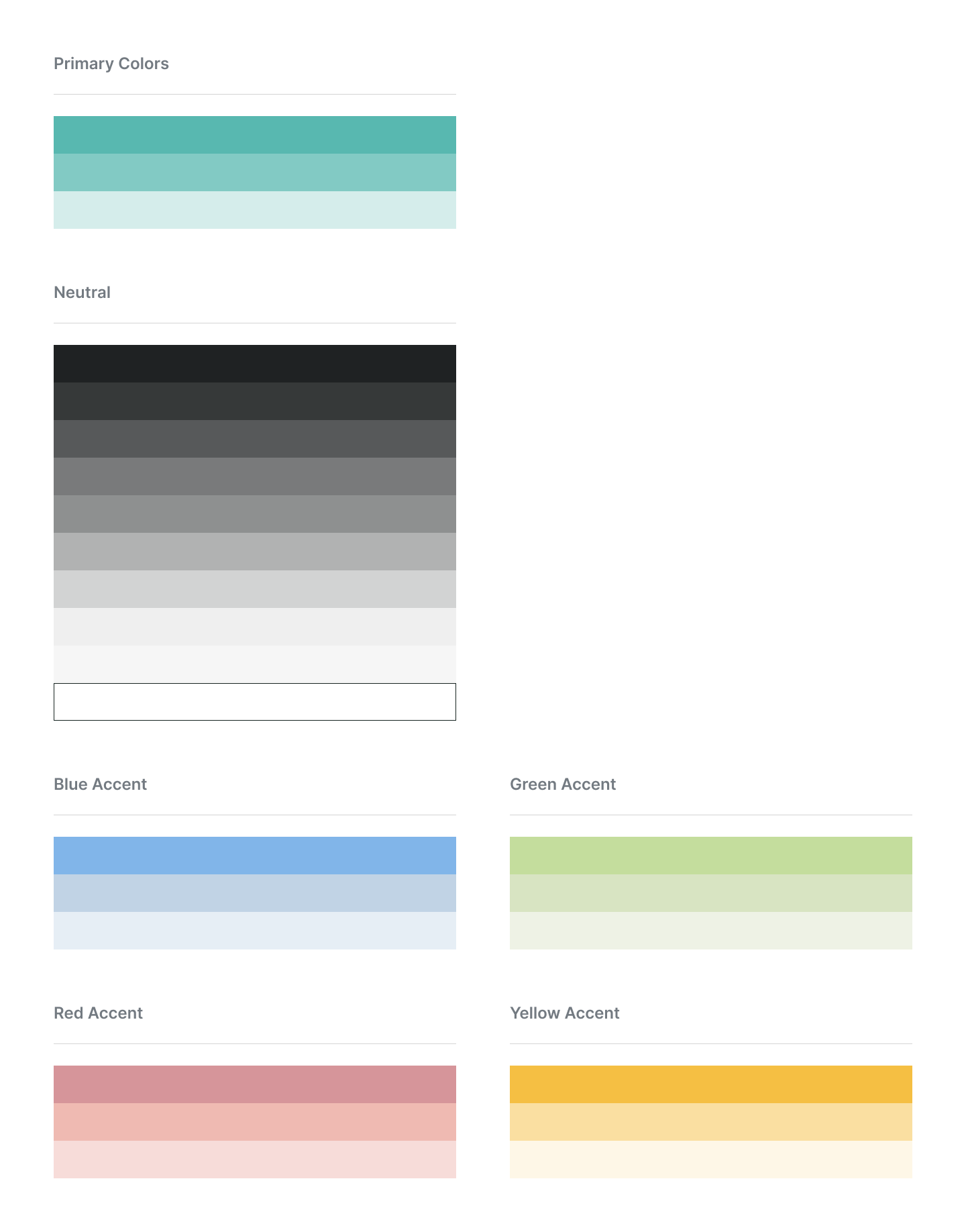
DESIGN GUIDELINES
Font Families, Type System and Color Palette
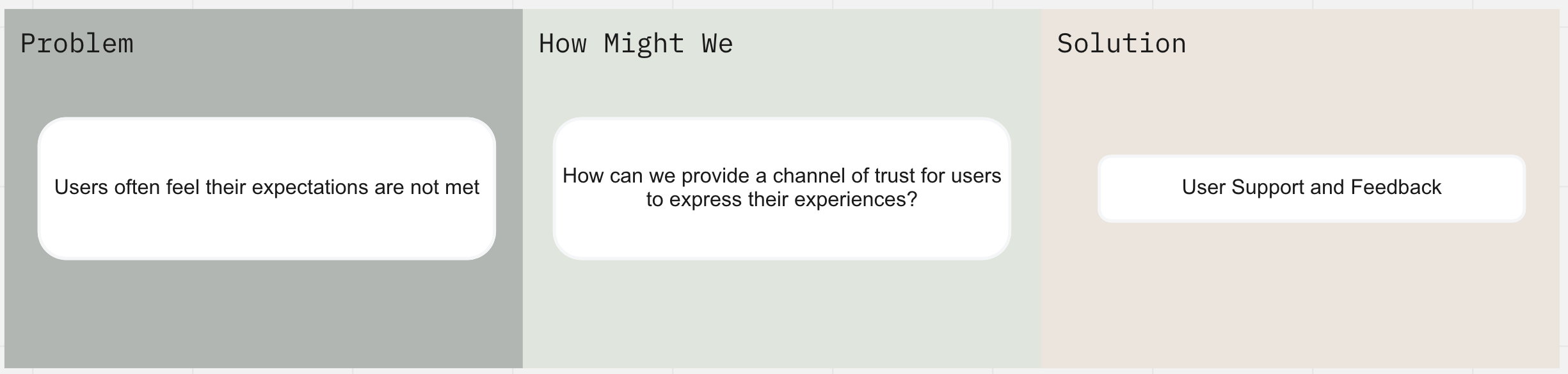
The problem I had to solve
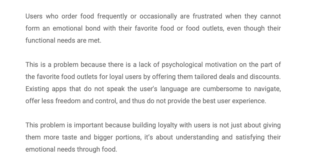
Users who order food frequently or occasionally are frustrated when they cannot form an emotional bond with their favorite food or food outlets, even though their functional needs are met.
How I came to my proposed solution
The contextual nature of UX design is why I am completely against blindly adopting design trends or copying designs from completely different contexts – with proper research, users, their needs, motivations, and social contexts were identified. After conducting surveys and interviews, it became clear that while users are satisfied with the delivery apps available, they do not have the ability to form an emotional connection with their own bakery, suggesting that the company has the potential to introduce its own app that would give users a great experience.
The next big challenge was to find the unique feature that really matters and that other apps don’t have. That’s how I came up with the idea: in addition to the main motivating features like discounts and rewards, with just one tap on their phone, users can give or share the food item available in the bakery to someone they think really needs it (for a good social cause), or they can gift or surprise family and friends with food, either daily or on special occasions or whenever they want through the app.
How my proposed solution solved the problem
I conducted a usability test with some users, and it was obvious that my key design idea increased the curiosity of the users. The users were able to perform the given task, there were only minor problems to uncover. However, I discovered opportunities to improve the design. I analysed the findings and converted them into redesign recommendations for the next iteration. With each iteration it got better. The client is also convinced that the design will have a positive impact on both users and the business that he finally hired a developer to work on the app.
My role in the project and how I collaborated with others
I was the sole UX designer on a team comprised of a business owner, a subject matter expert, and a developer. I was responsible for determining the overall design direction of the project, while collaborating with the rest of the team on ideation.
Miro is my first stop when I need to brainstorm ideas on my own or with my client. It has helped me organize my own thoughts and ideas and of course collaborate and get feedback.
Challenges I faced as the one-person UX Team
The client did not have an app development partner to start with , and there is a requirement for third-party integration in this app. It was a big challenge to mentally model the food delivery API and the architecture of the system along with the visual design without discussing with the developers. I feared falling into the “jack of all trades but master of none” category because I worked in isolation.
What I learned in the course of this project
This project has given me the confidence to do the UX all by myself – a full, flexible UX process that encompasses all aspects of the UX cycle, regardless of how much support, time, and help I have on hand.
I’ve gotten better at managing my time, communicating my ideas, and of course I’ve stumbled across a lot of features in Figma that I wish I would have known about sooner.