PROBLEM STATEMENT
Our health-conscious people need a simple, efficient, and safe way to manage all their medical needs and wellness resources so that they can seamlessly follow a schedule every day to maintain a healthy lifestyle.
We will know this is true when we see how many health-conscious individuals constantly trust our app to invest time in themselves to follow daily wellness routine and to have on-demand access to their health record.
PROBLEMS IDENTIFIED WITH EXISTING APPS
- Identical and isolated features
- Complex process
- Too many manual inputs
- Lack of trust
- Fails to demonstrate definite clinical benefits to target users
RISK/OPPORTUNITY
- App store is saturated with many health, fitness and wellness apps.
- Users are unsure of the confidentiality of their health and personal information.
- There is no single app that promotes the entire work-life balance.
- People may want to experience all kinds of health tracking under one roof.
POTENTIAL SOLUTIONS
- An easily accessible, highly secure, simple app
- A simple health, wellness, fitness tracker
- Offers only the relevant functions
- Clear and appealing data visualisation
- Medical data and appointment details under one roof
USER STORIES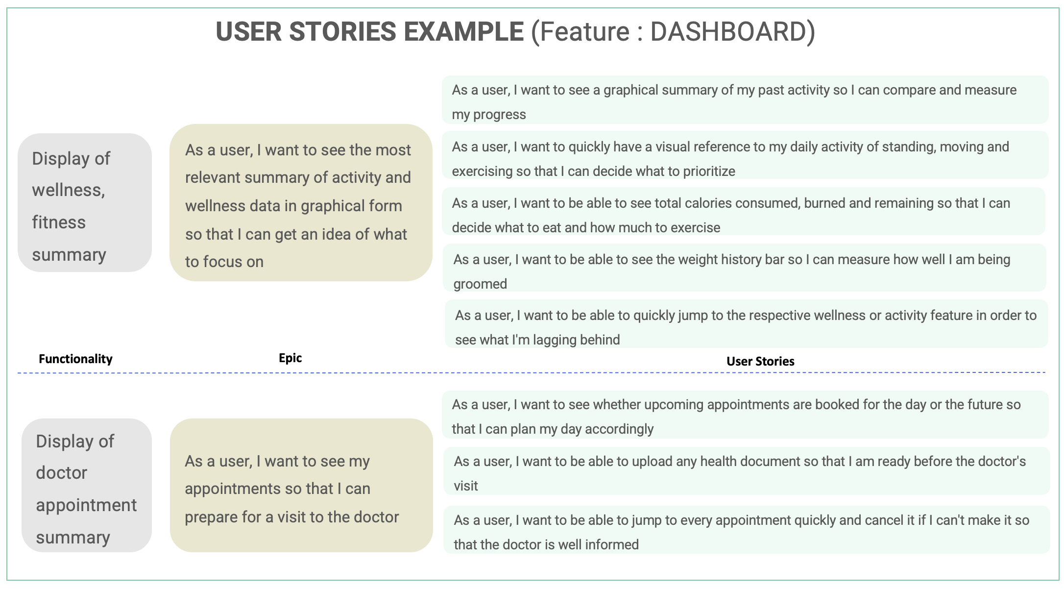
USER SURVEY GOAL
- Understanding user behavior around health activities with the help of digital media.
- Documenting pain points with existing health apps available in various app stores.
- Understanding the psychology of users to analyse the motivating factor in using a health app to maintain physical and emotional balance in life.
I have used this as a tool to get discrete, quantitative feedback from many participants before conducting interviews to validate my research goals.
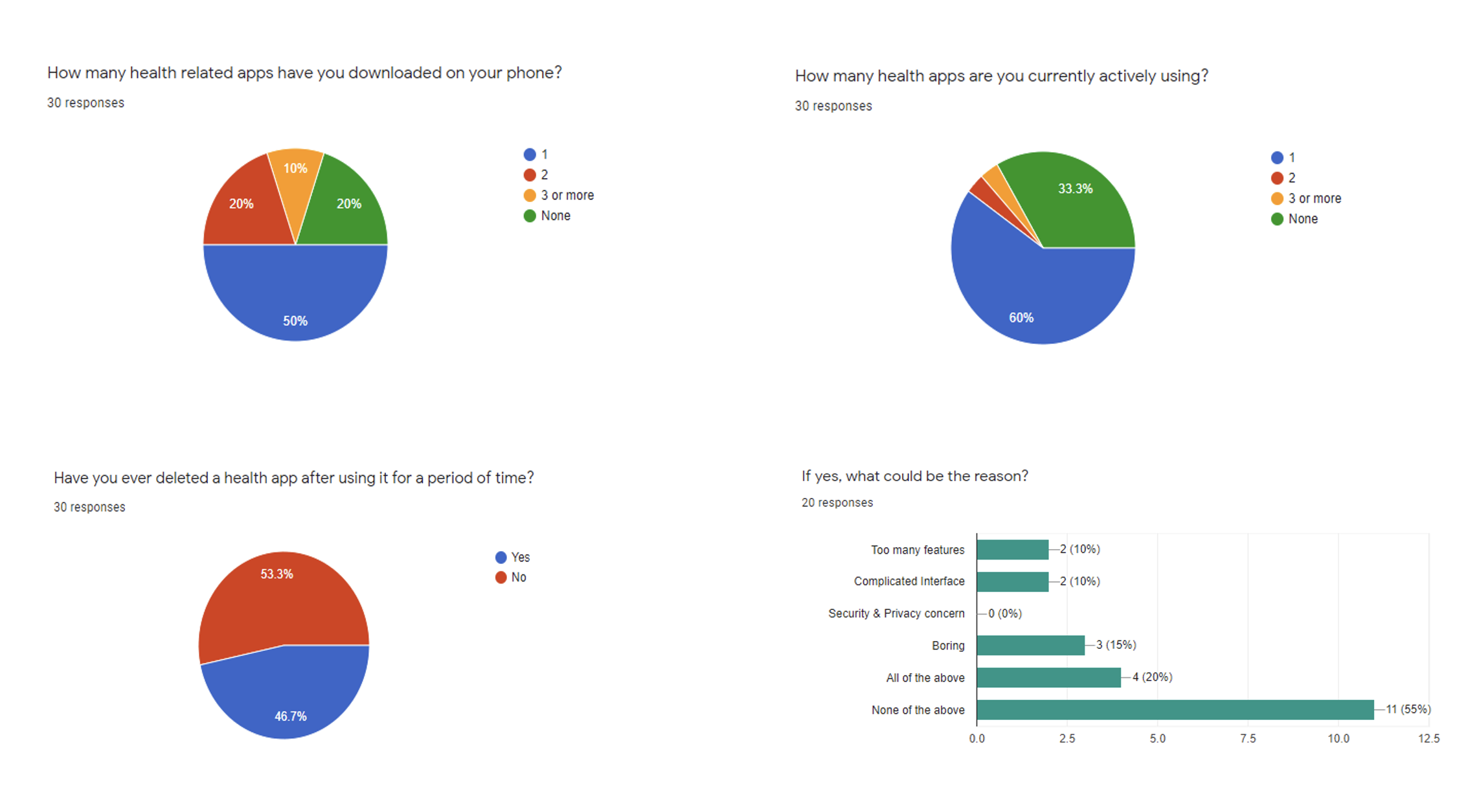
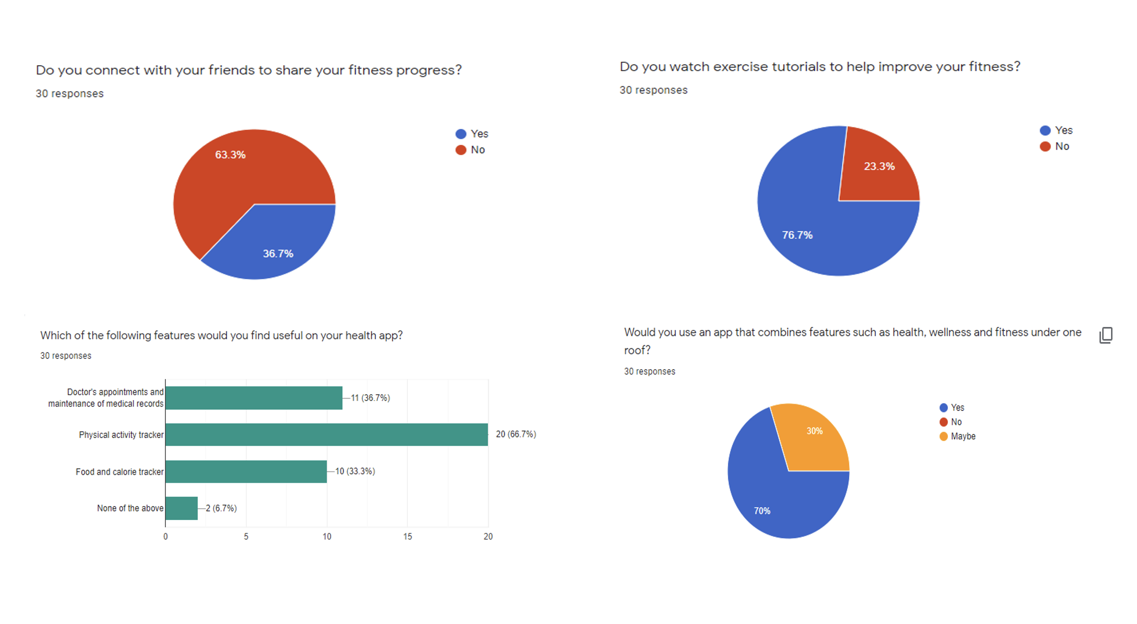
RESEARCH GOALS REFINED AFTER SURVEY
- Understand if the user is health conscious and has taken the time to download a health-related app to review their own health / lifestyle.
- Understand which areas of health and wellness interest users most to keep track of overall wellbeing.
- Documenting pain points with existing health apps available in various app stores.
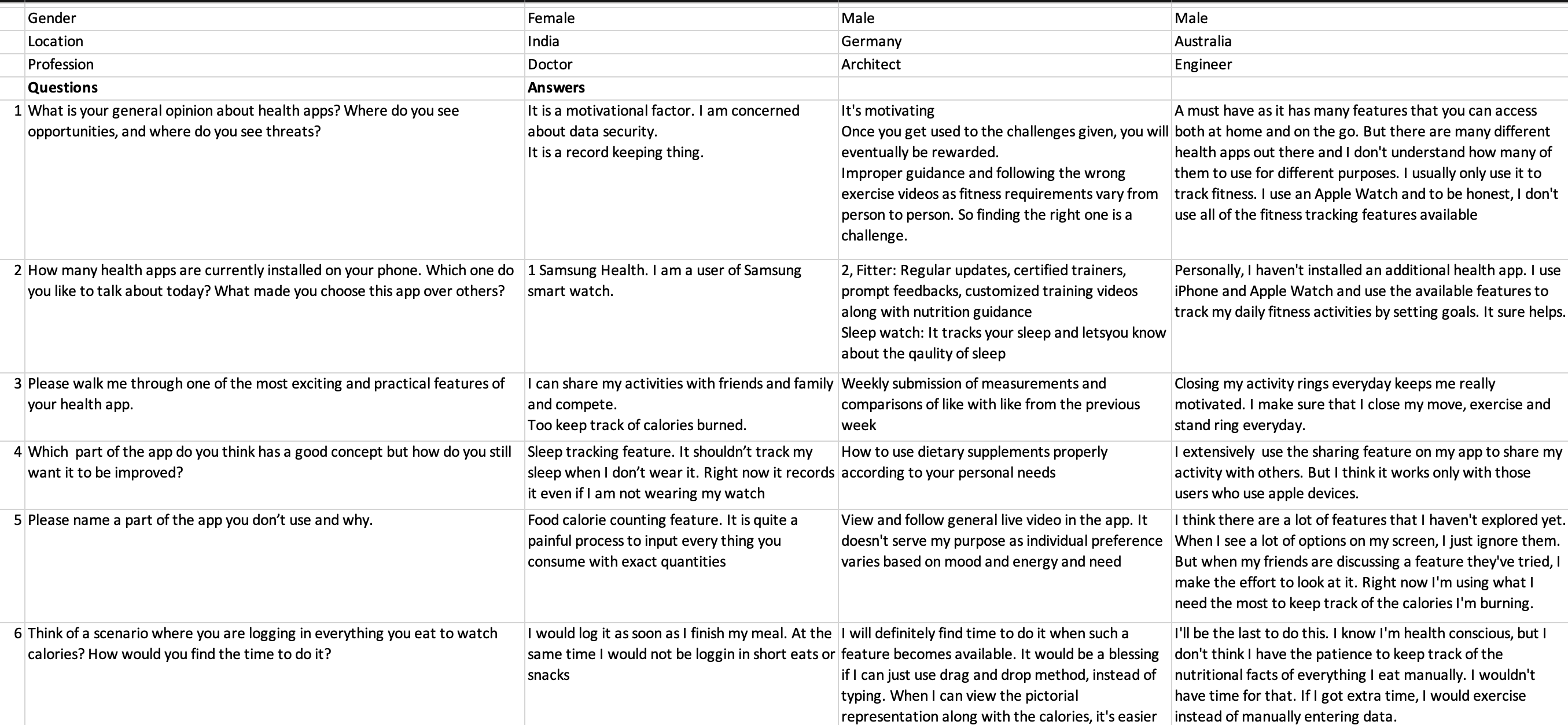
USER INTERVIEW
To get open ended, qualitative feedback from few users.
- Conducted 3 interviews over two days.
- One interview was conducted in person.
- Two interviews were conducted online.
USER INTERVIEW QUESTIONS
To get open ended, qualitative feedback from few users.
- What is your general opinion about health apps? Where do you see opportunities, and where do you see threats?
- How many health apps are currently installed on your phone. Which one do you like to talk about today? What made you choose this app over others?
- Please walk me through one of the most exciting and practical features of your health app.
- Which part of the app do you think has a good concept but how do you still want it to be improved?
- Please name a part of the app you don’t use and why.
- Think of a scenario where you are logging in everything you eat to watch calories?How would you find the time to do it?
- How much of a role does connecting with your fellow members of your fitness community play in motivating you to stay fit?
- Tell me your experience where in you freaked out because you missed a day of your exercise. How did you catch it up?
- Suppose you make a commitment to stay fit. How do you stay motivated to accomplish that goal?
- Tell me about a situation when your health app did not meet your expectations. What did you do to get over it?
- How would setting up and managing appointments with your physician online help you?
- If there was one way to be efficiently reminded of all your doctor appointments, what would it be?
- Tell me about an occasion where you would have wished you had your doctor’s prescription or existing medication refills online.
- What has been the biggest frustration when it comes to tracking of your medical history and records?
- Please share your experience about storing private and health-related information on the internet.
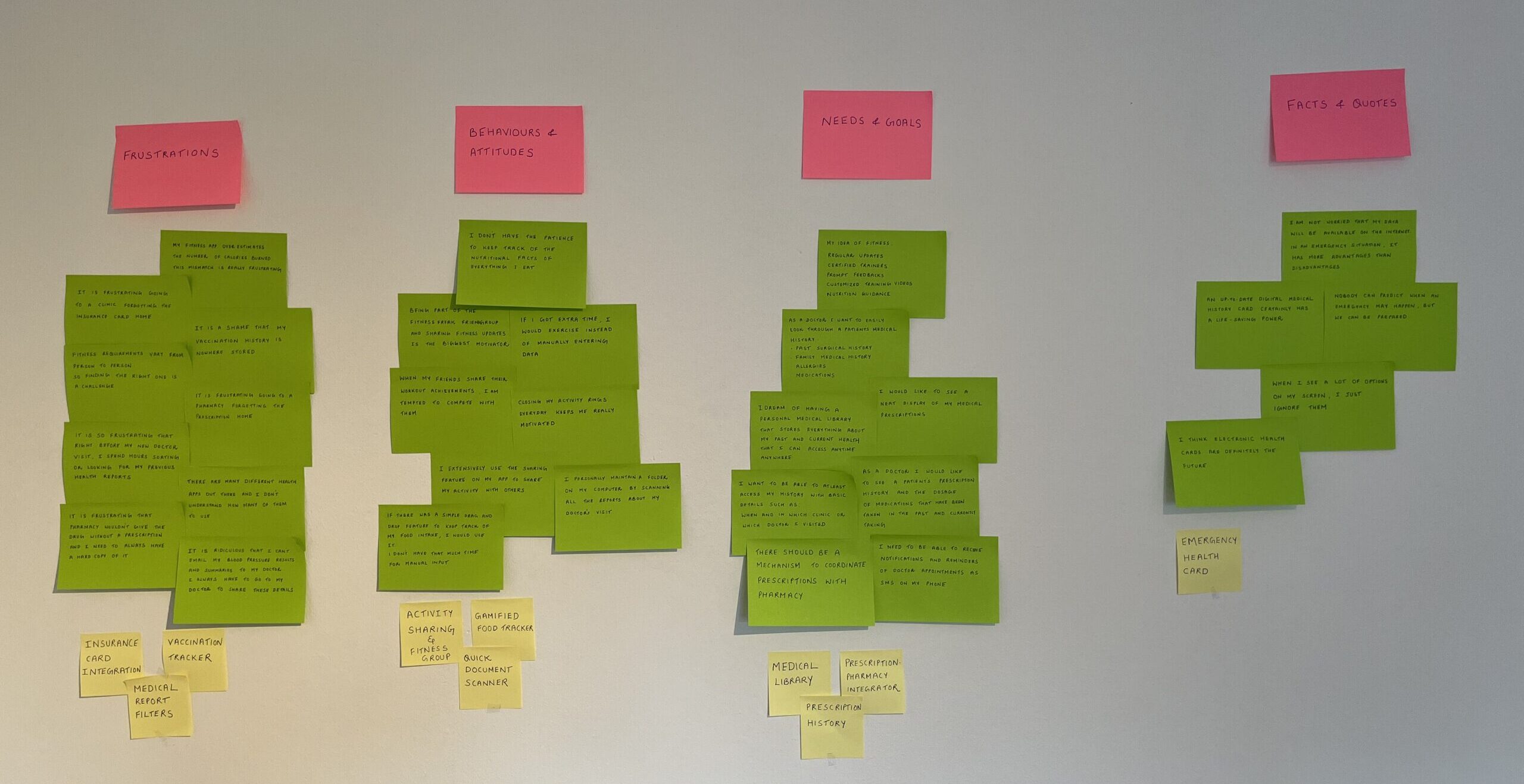
KEY INSIGHTS
- Users are looking for a product that has minimal features but is extremely efficient.
- Fitness Tracker tops the list of functionalities.
- People don’t really worry about privacy as I expected.
- The Food Calorie Tracker is not for everyone as it is time consuming.
- The digitisation of medical records has great potential.
In general, the health app has the potential to create a constant source of health awareness.
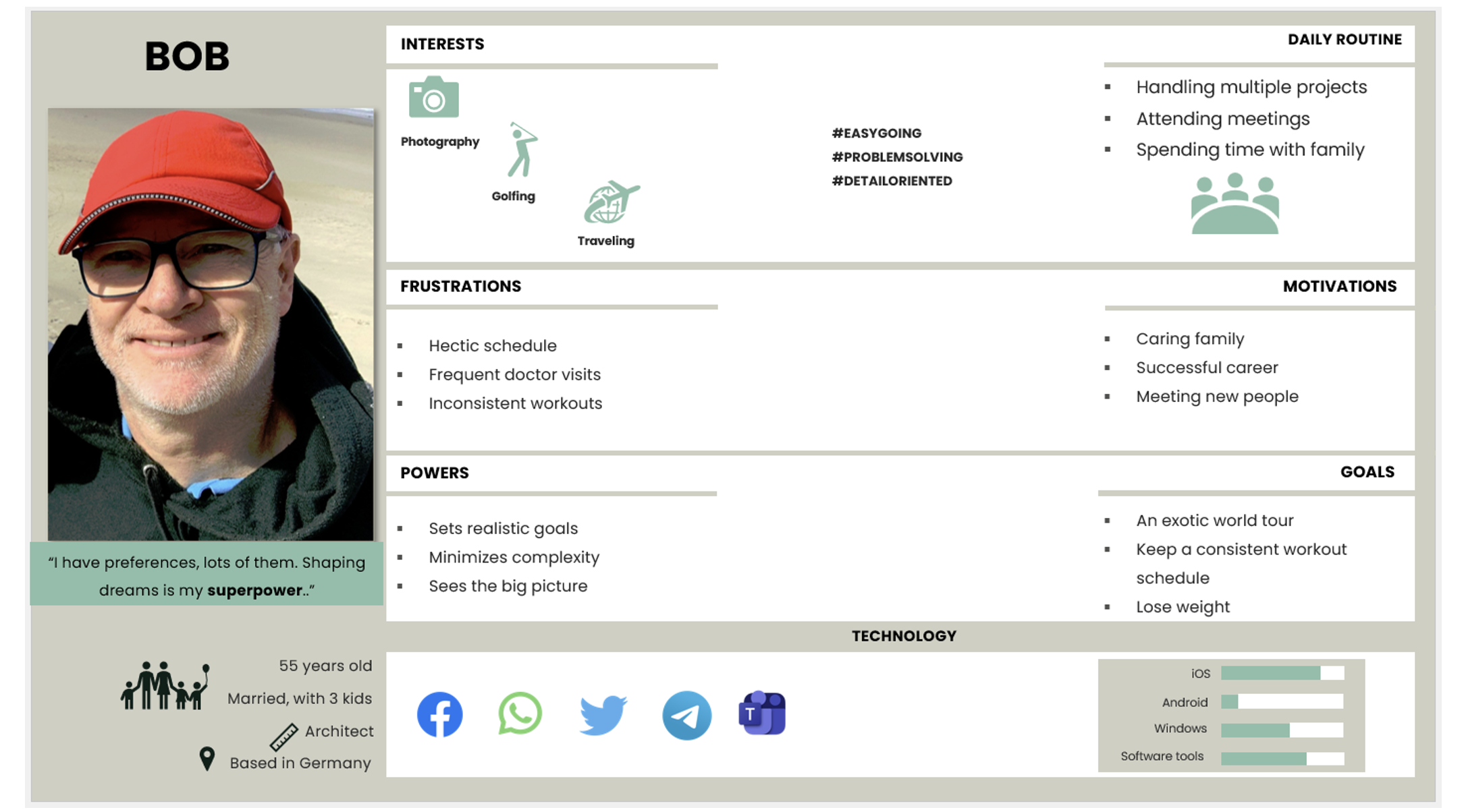
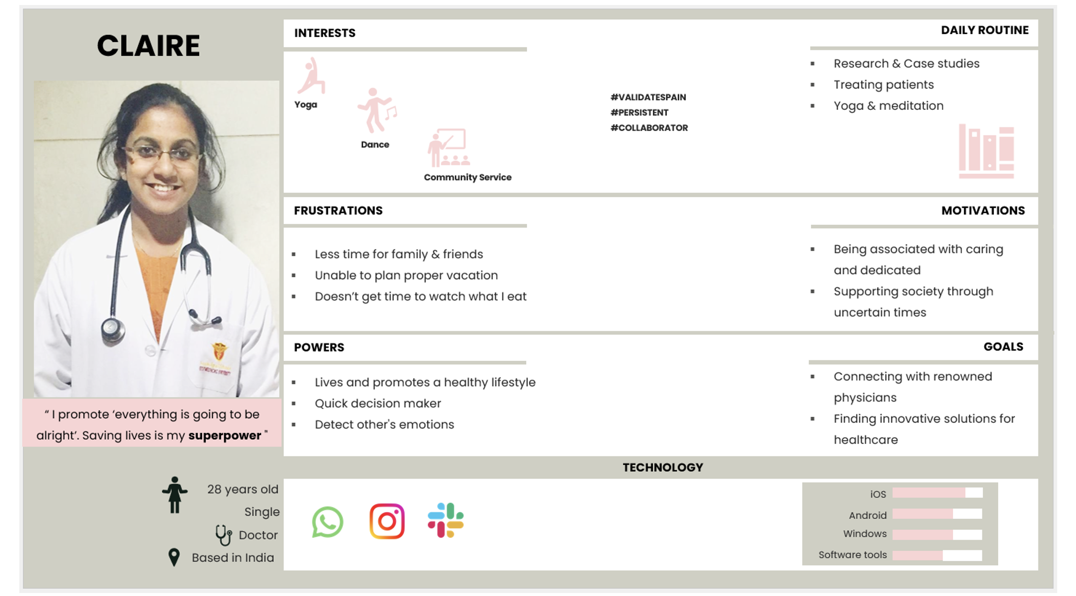
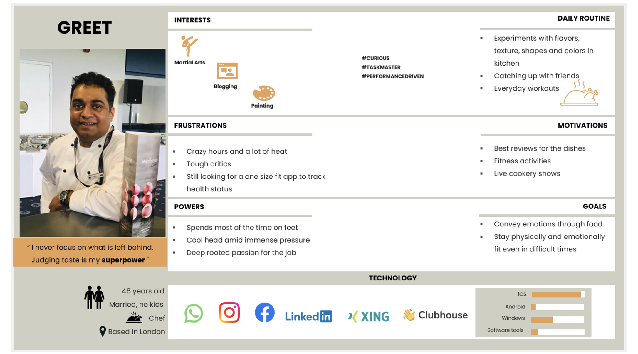
USER PERSONAS
Constructed 3 personas and each of my personas are different entities entirely. They contain relevant and unique personal details and represents a specific audience group that is well supported by research and data collected from my surveys and interviews.
I have used this as a tool to establish empathy with users and answer the question “Who are we designing for?”
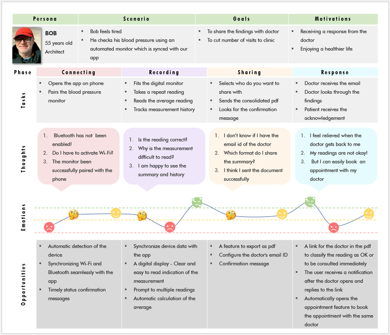
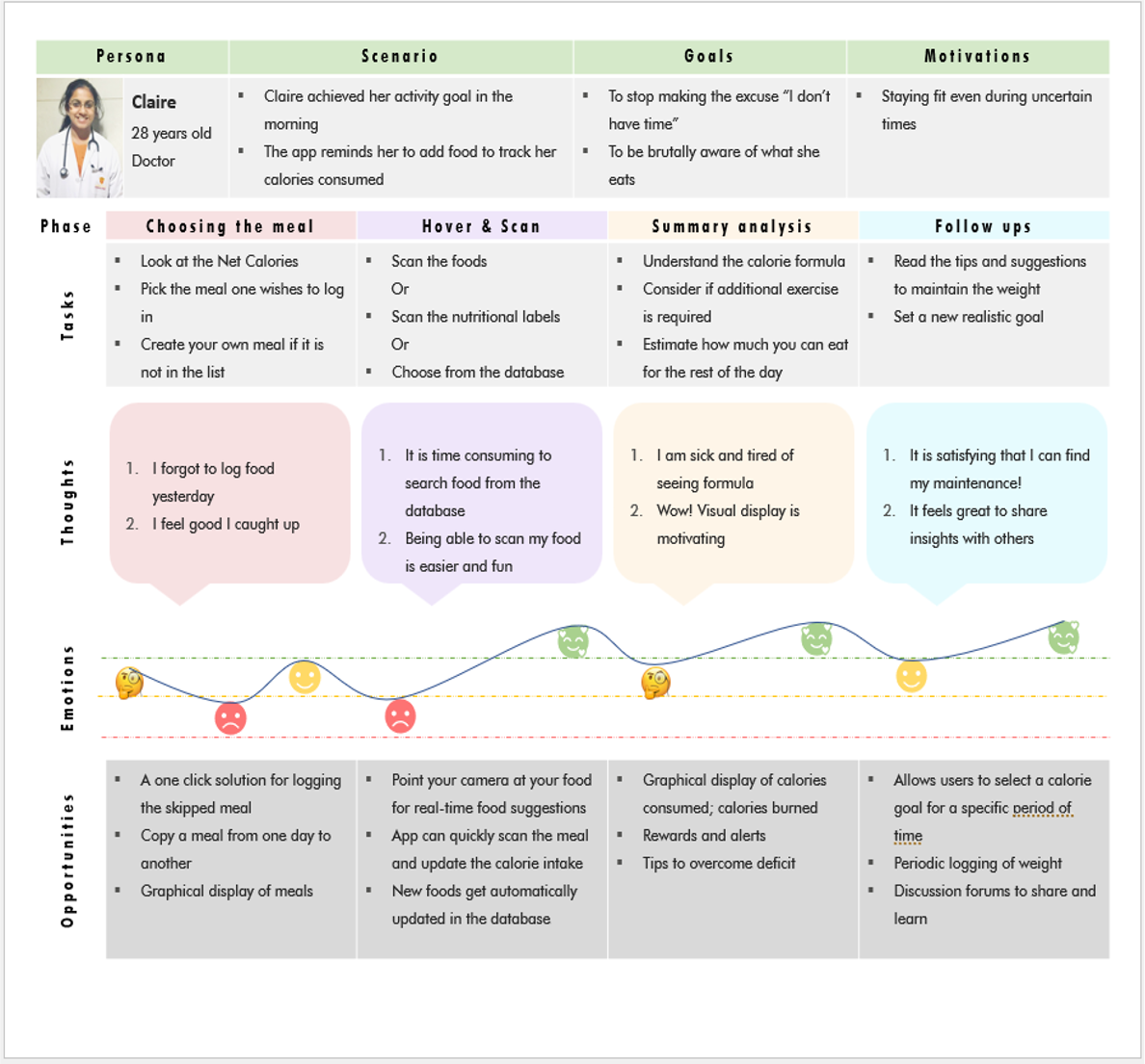
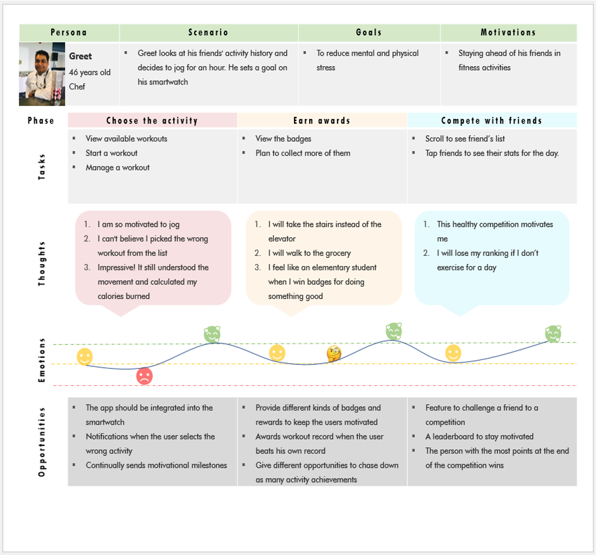
USER JOURNEY
Created 3 journey maps informed through qualitative research. These maps include primary tasks, user thoughts, and recommendations are clearly defined, relevant, and actionable; the visual design effectively tells a story of the journey.
I have used this as a tool for visualizing the processes a user goes through in order to accomplish a goal.
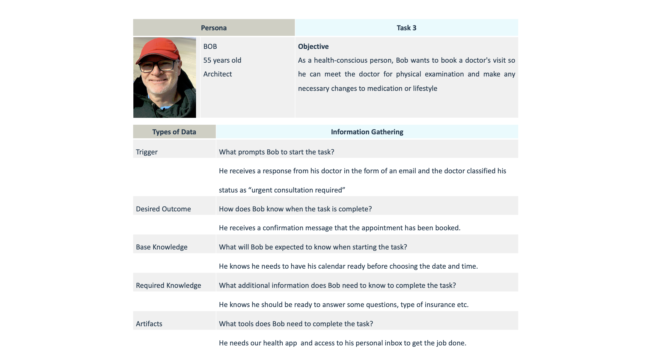
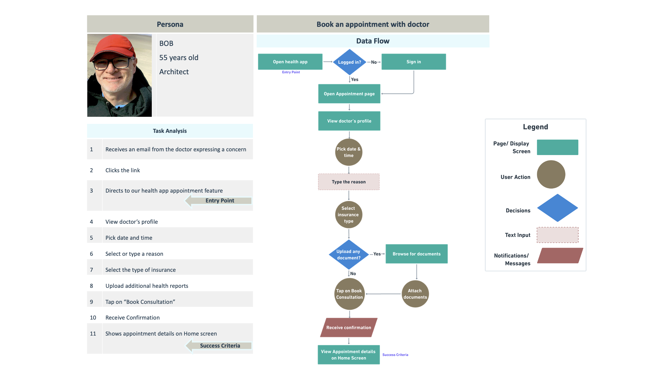
TASK ANALYSIS & USER FLOWS
Mapped out task flows for each of the 3 primary objectives. The flow clearly illustrates my persona’s process through the product and includes well thought out alternative paths.
I have used this as a strategy to walk myself through all of the individual steps needed to complete the task keeping my persona and objective in mind.
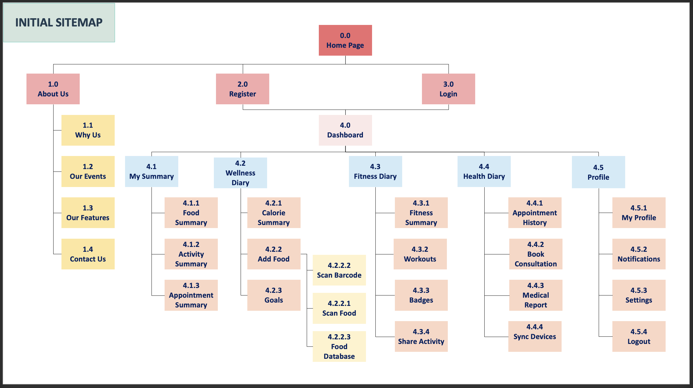
INITIAL SITE MAP
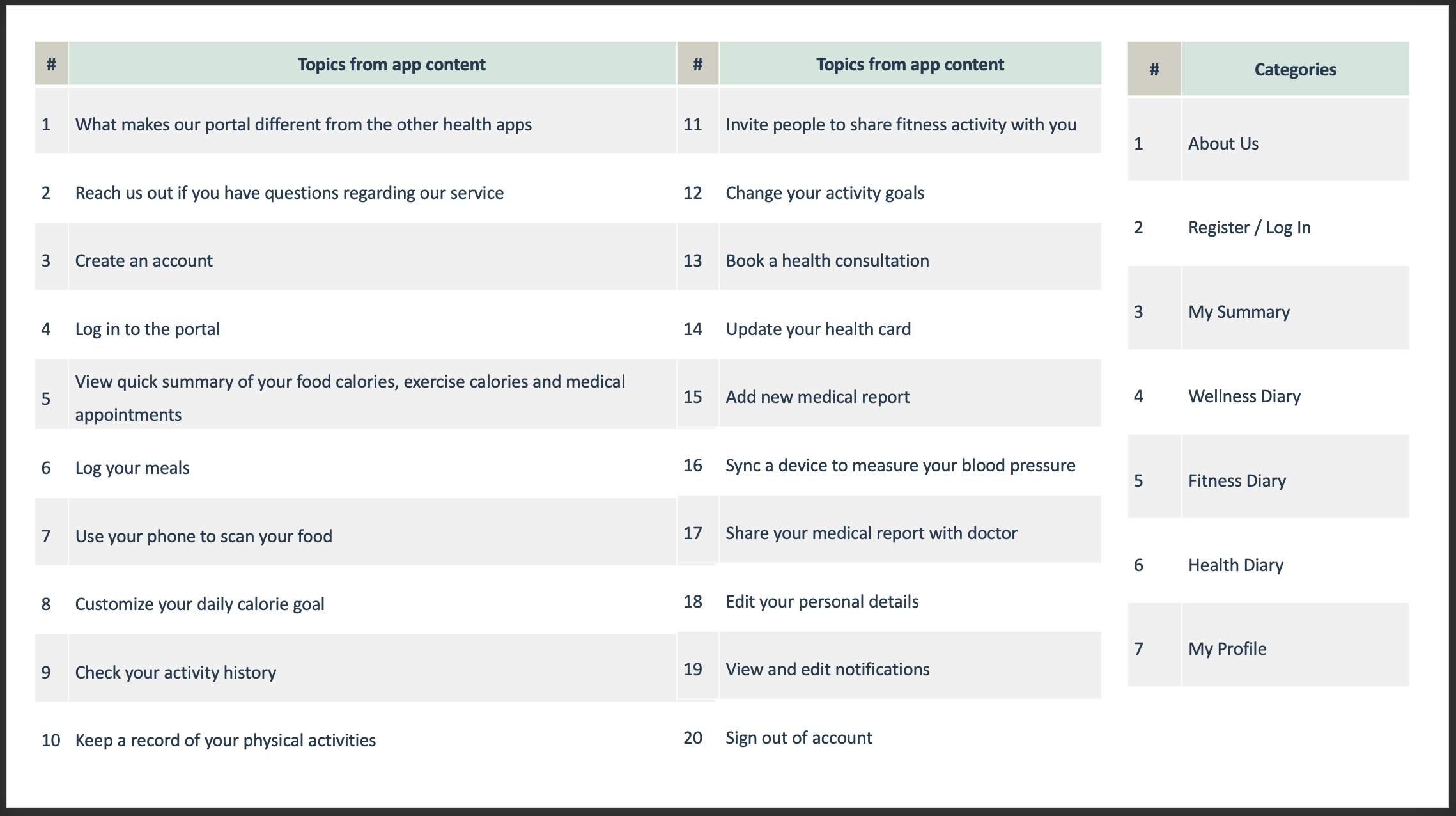
CARD SORT
I have used card sort as a tool to generate ideas to better design the information architecture of my application
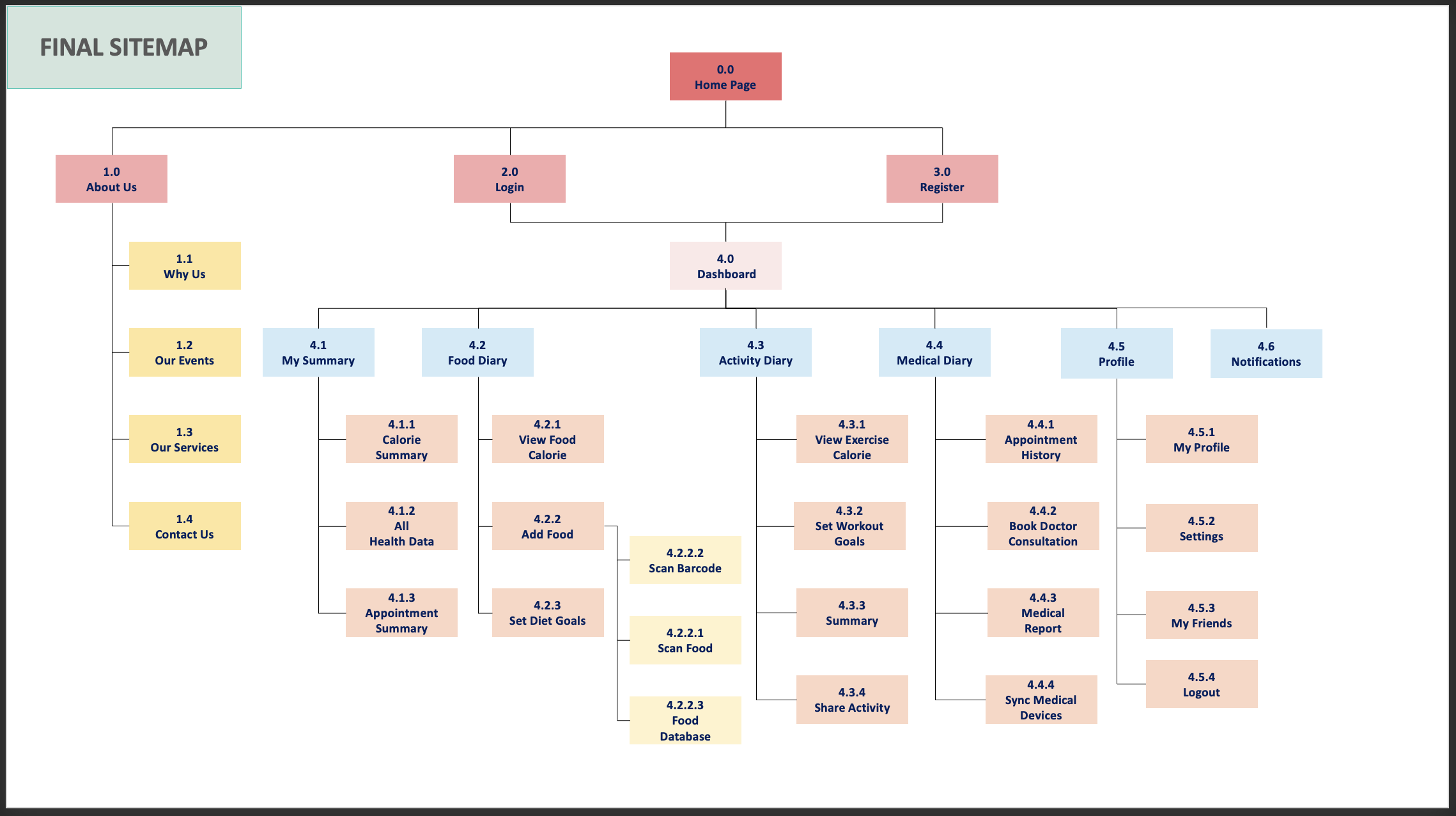
FINAL SITE MAP
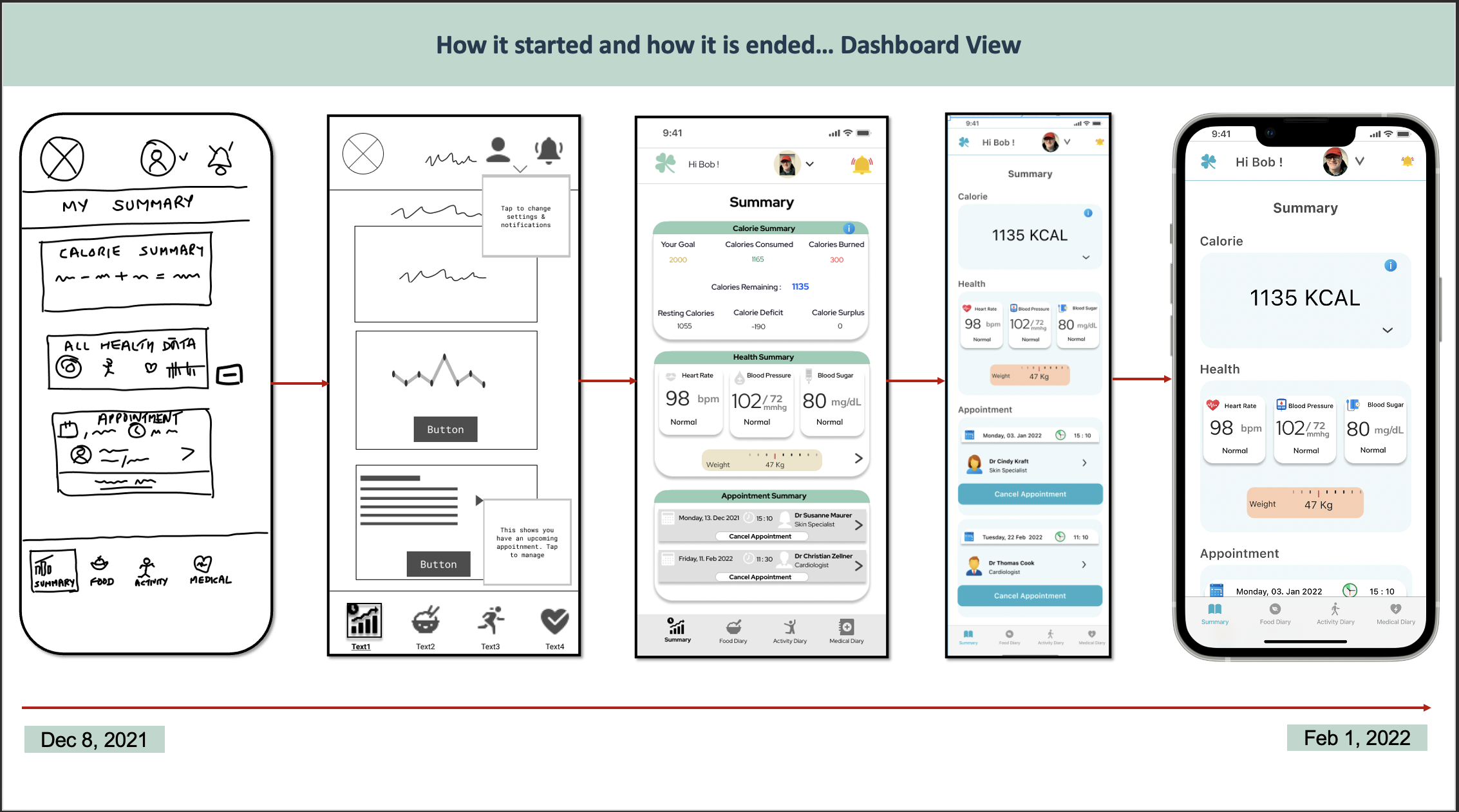
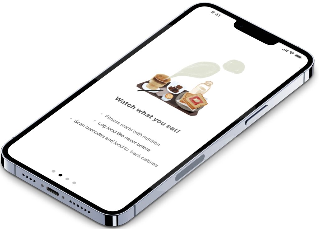
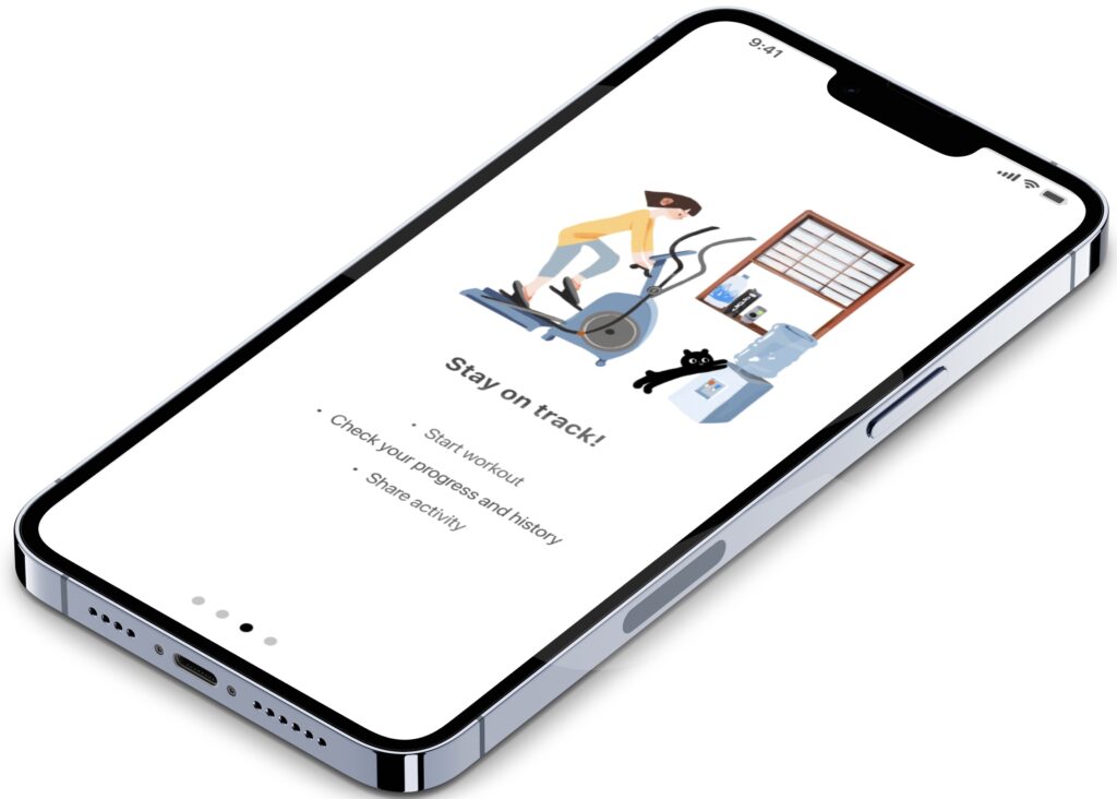
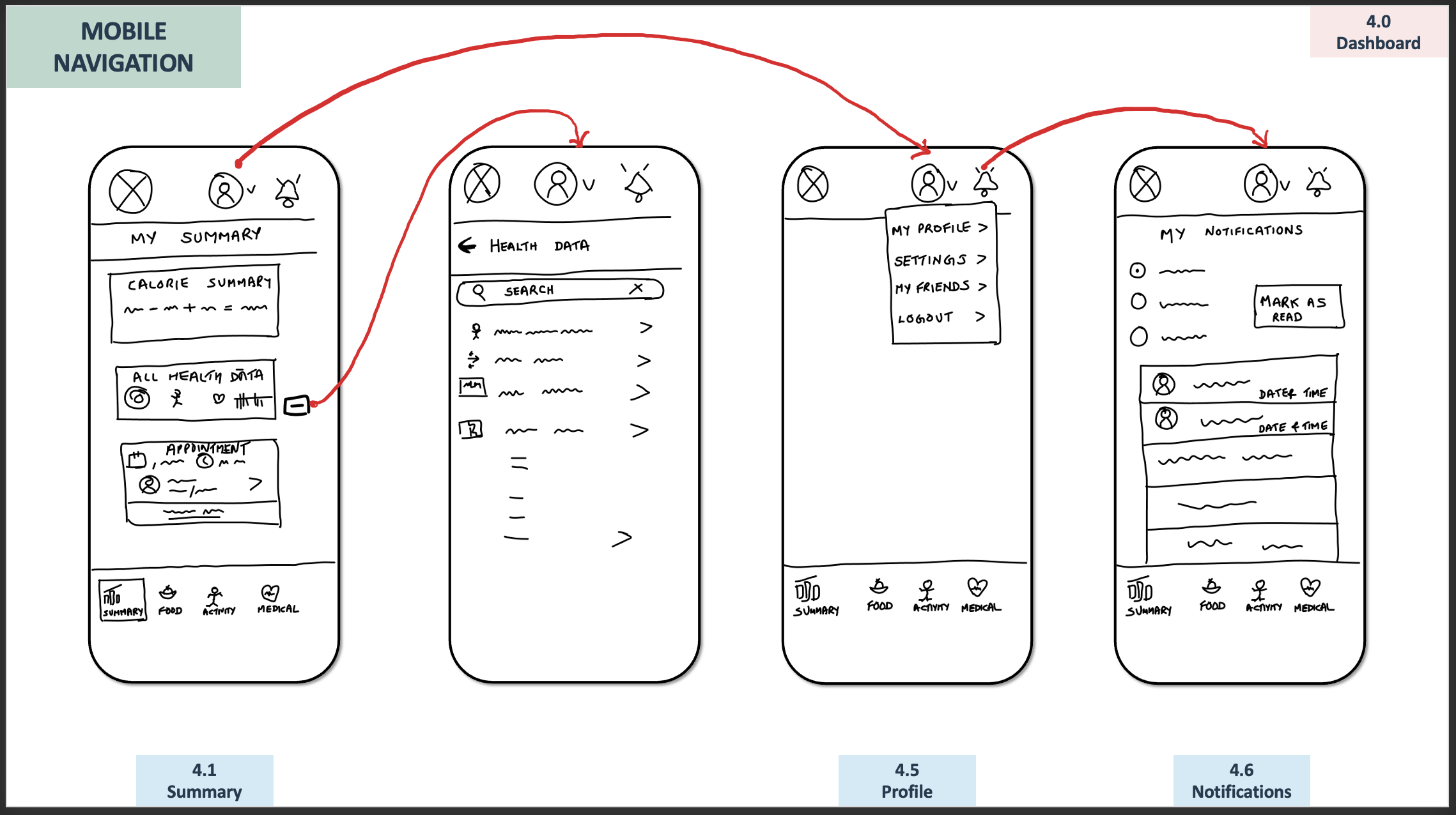
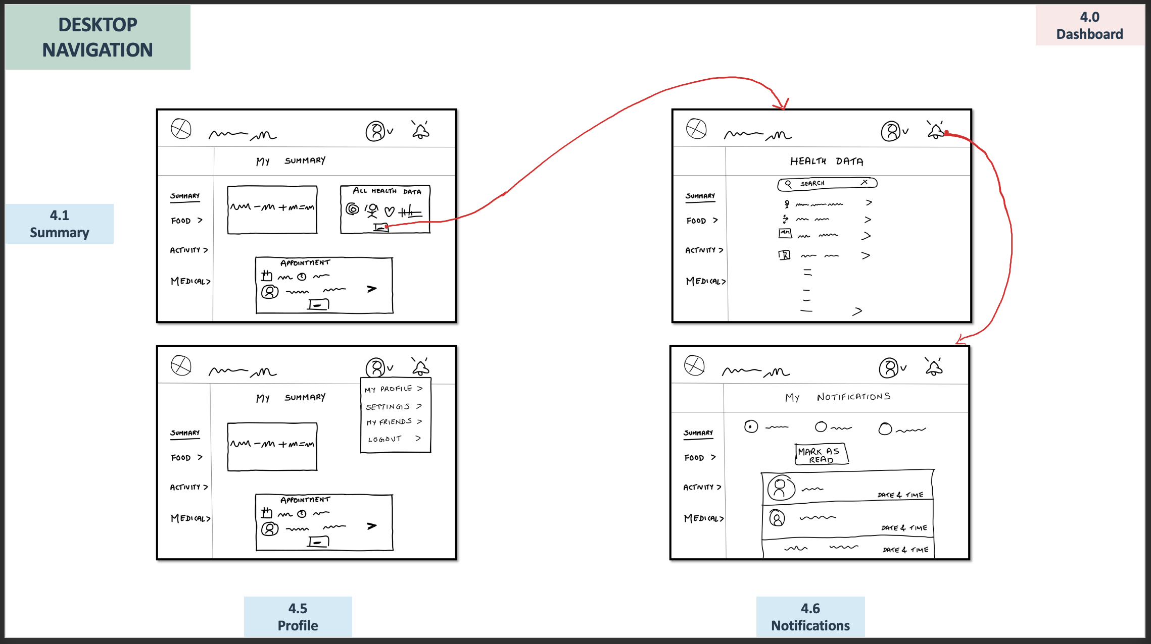
LOW-FIDELITY PROTOTYPES
I used rough sketches as a tool to illustrate user flow and architecture of major features for both mobile and desktop versions.
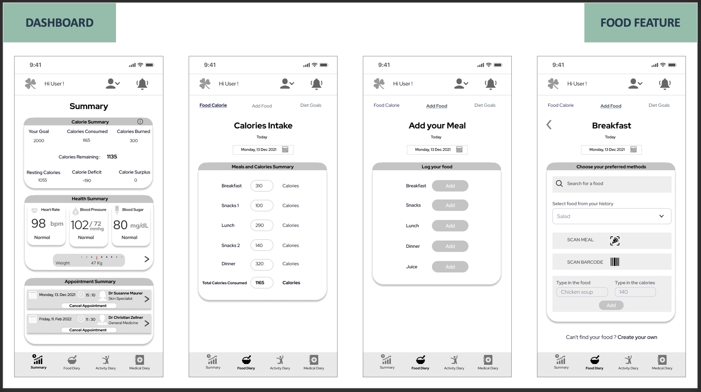
MID-FIDELITY PROTOTYPES
I used this as a tool to represent different levels of details of my mobile application.
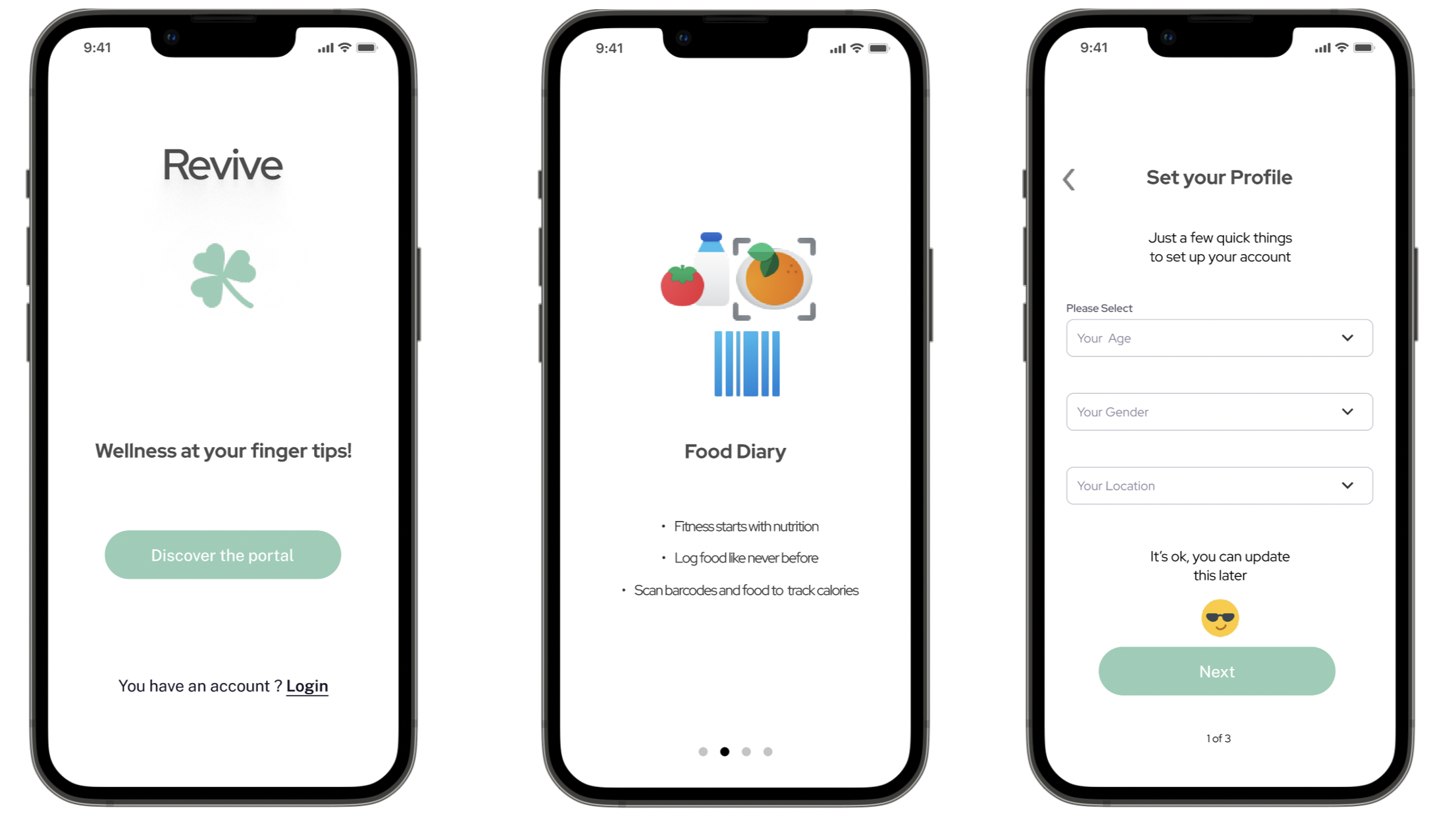
HIGH-FIDELITY PROTOTYPES
I used this as a tool to put all high-fidelity wireframes together to offer some level of interactivity
TEST PLAN
Created a document that outlines the scope goals, and logistical details of usability test session in advance.
Please click here to view the Usability Test Plan
TEST SCRIPT
Developed a test script which is an outline of what I plan to say and communicate to my test participants.
Please click here to view the Usability Test Script
TEST REPORT
Please click here to view the Test Report
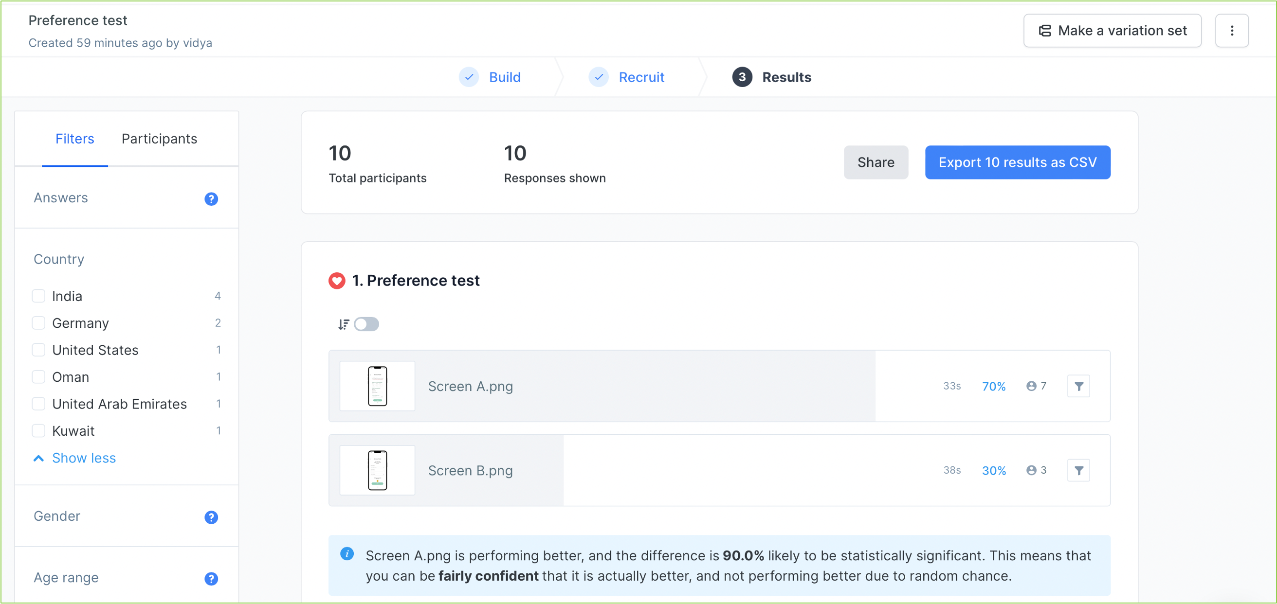
A/B TESTING
I chose to run a preference test on some of the most talked about controls of all time, like the date picker, combo box, and radio button that appeared on of my onboarding screens.
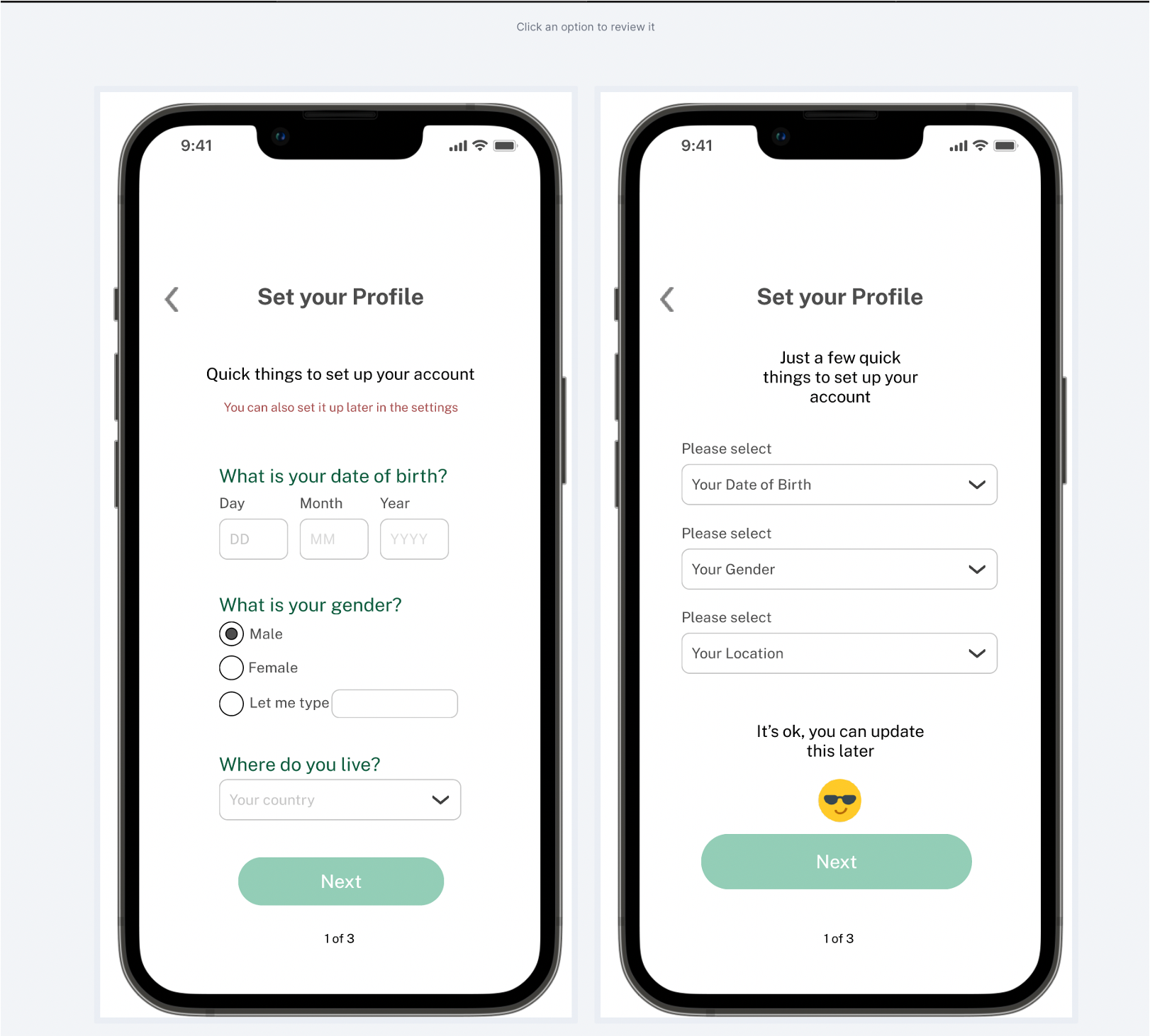
A total of 10 users participated enthusiastically and the test clearly shows that screen A is preferred over screen B.
LEARNINGS
The preference test gave me a good idea of how to move forward with my prototype. It certainly helped me choose the right onboarding screen as the majority of users chose it and also for the following reasons:
- Typing the date would be faster than a drop down because there is no additional interaction as users already know their date of birth.
- There is no additional scroll and user is less likely to select a wrong data.
- Radio buttons for gender make all options visible and it is easier and clearer for users to process.
- Text looks bigger and better.
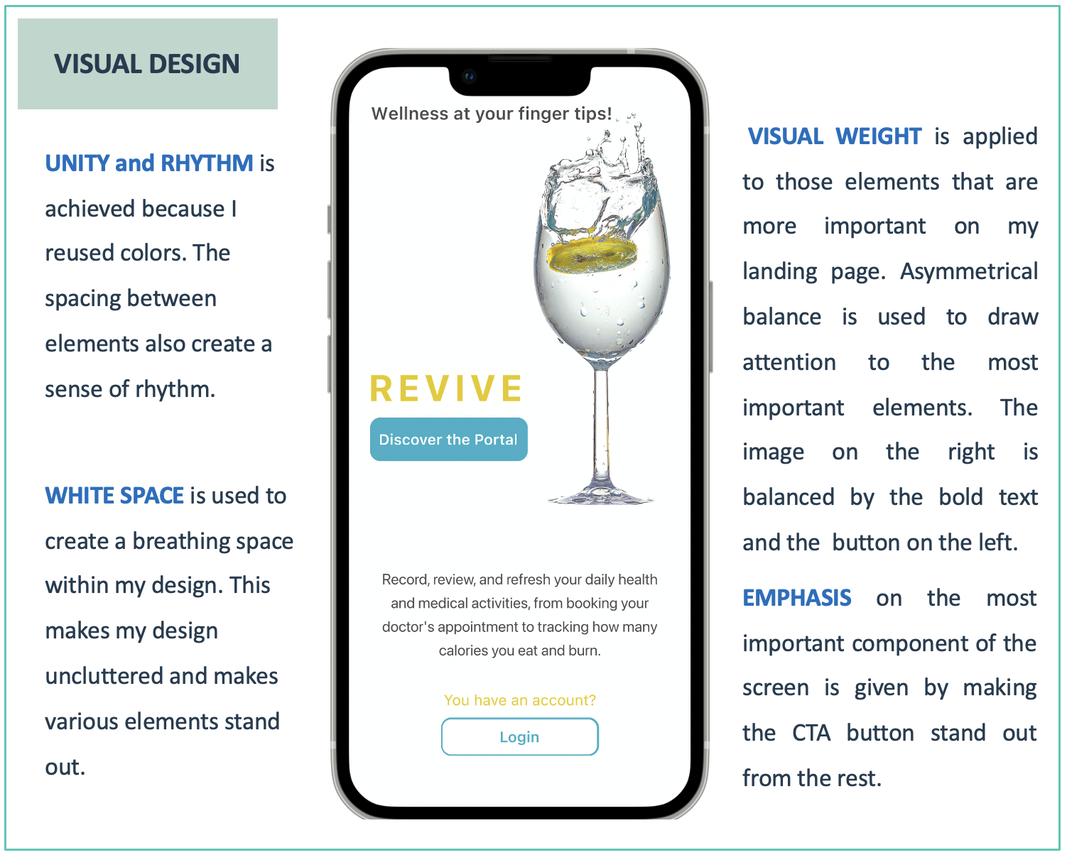
ITERATION BASED ON GESTALT’S PRINCIPLE
I combined Gestalt principles of designs and other principles to create a design that’s visually appealing and makes sense to the user.
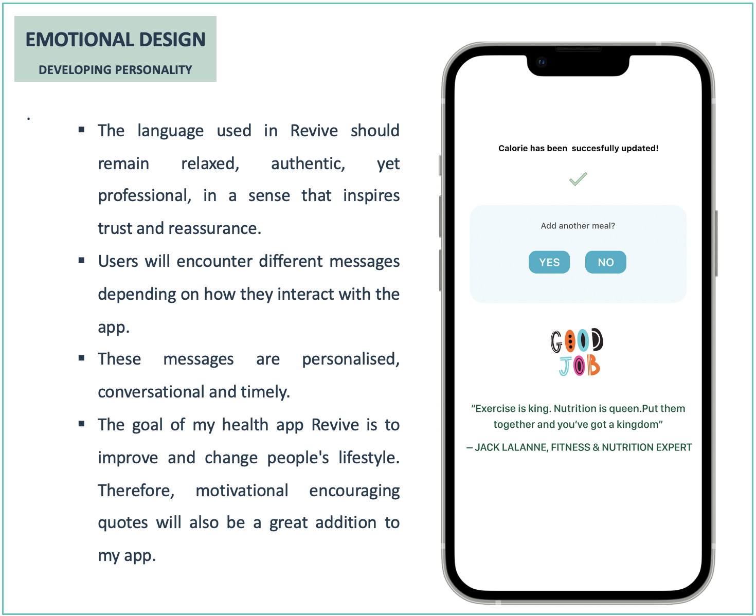
I developed an emotional design strategy to help my health app trigger all three experience levels (Visceral, Behavioral, Reflective) and fully engage users using emotion.
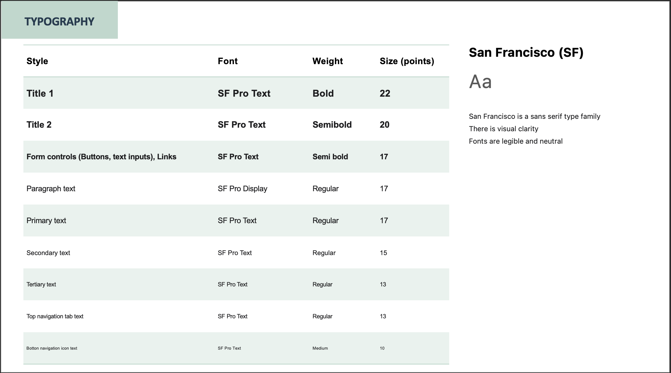
STYLE GUIDE AND PATTERN LIBRARY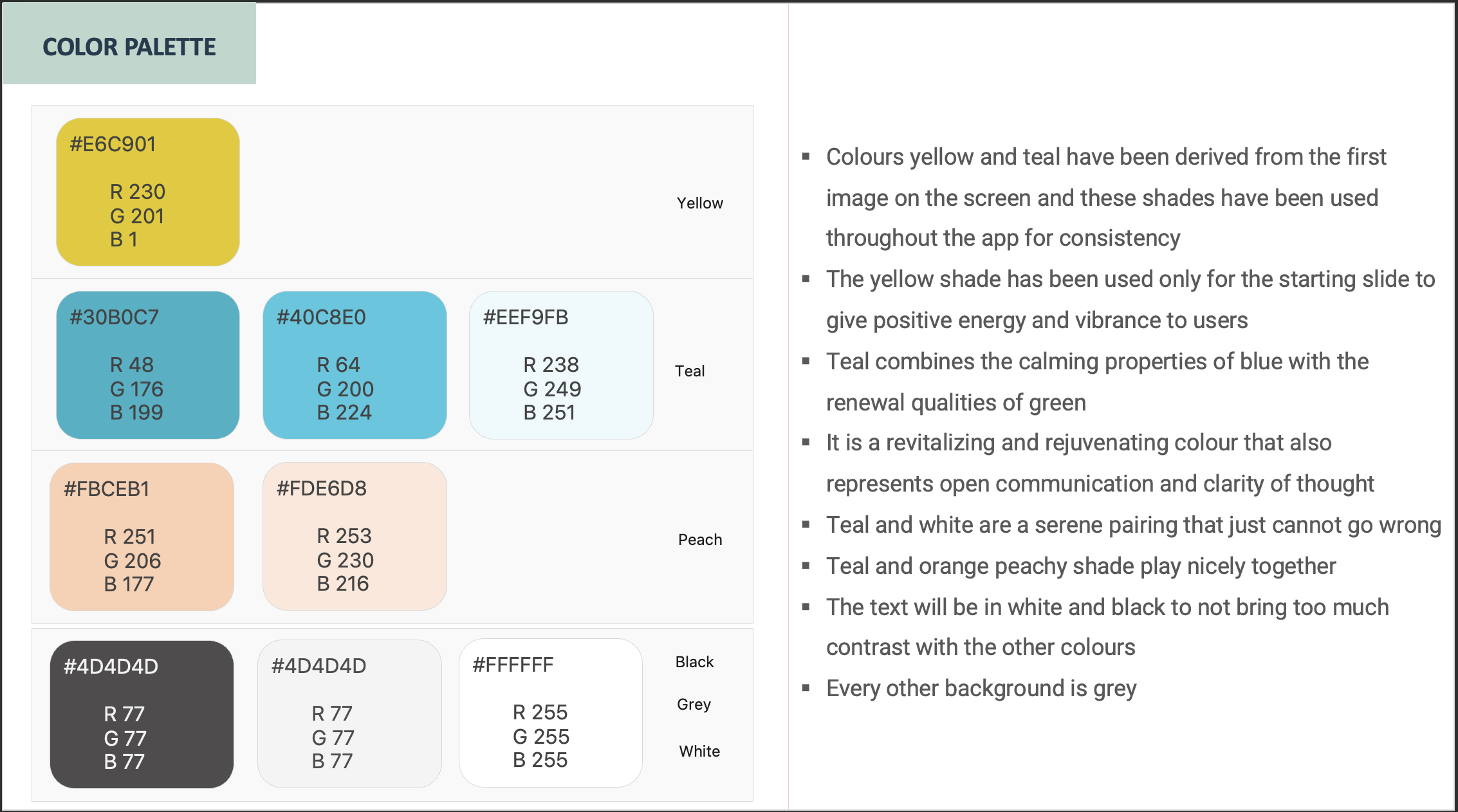
NEW ITERATION BASED ON PEER REVIEW RESULTS
Collaborated my design with other designers and asked them for feedback and critique.
DESIGNERS COMMENTS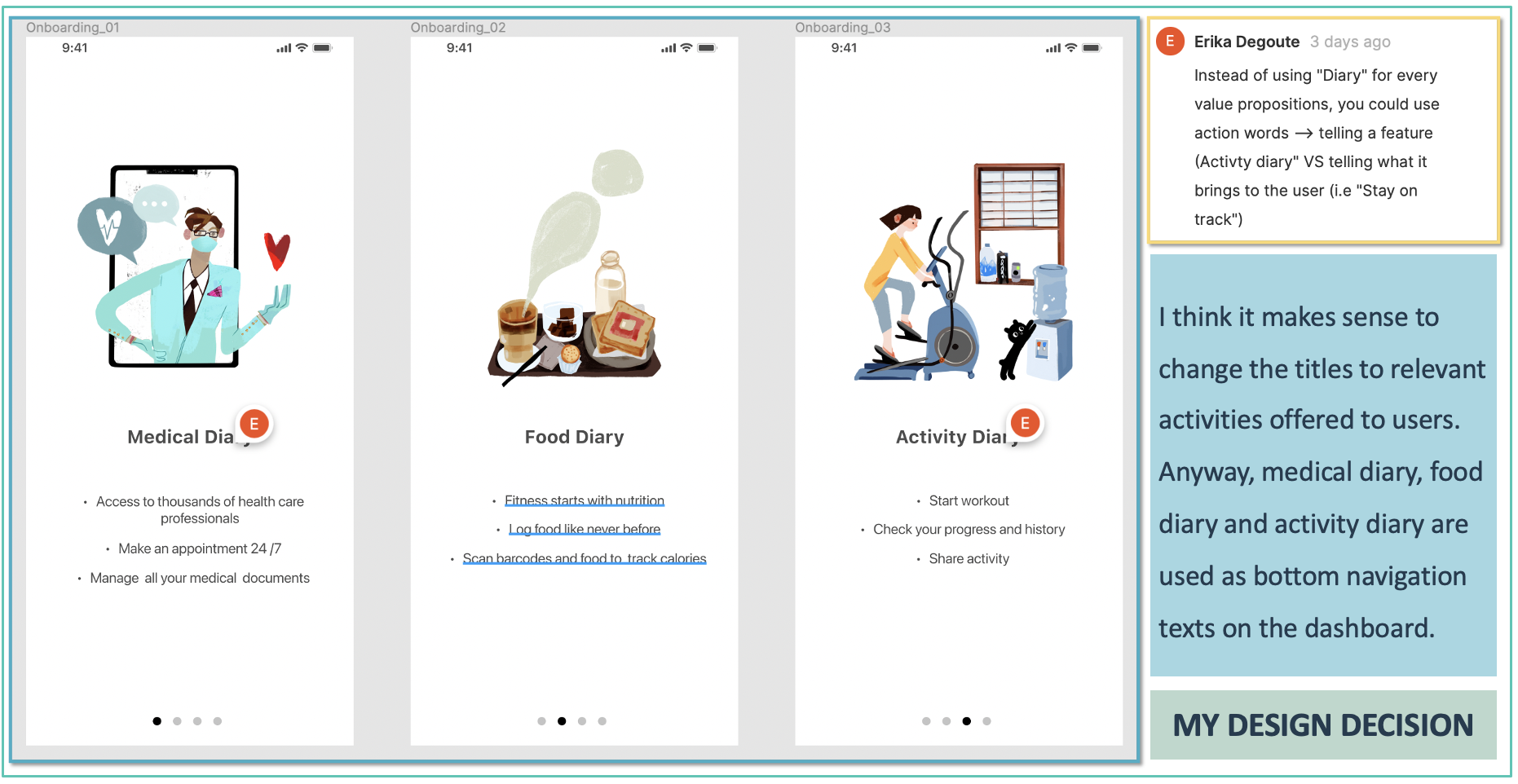
BEFORE REVISION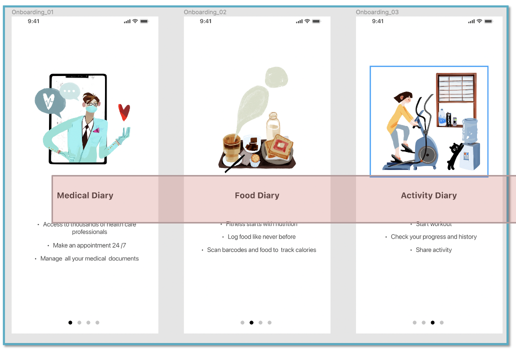
AFTER REVISION 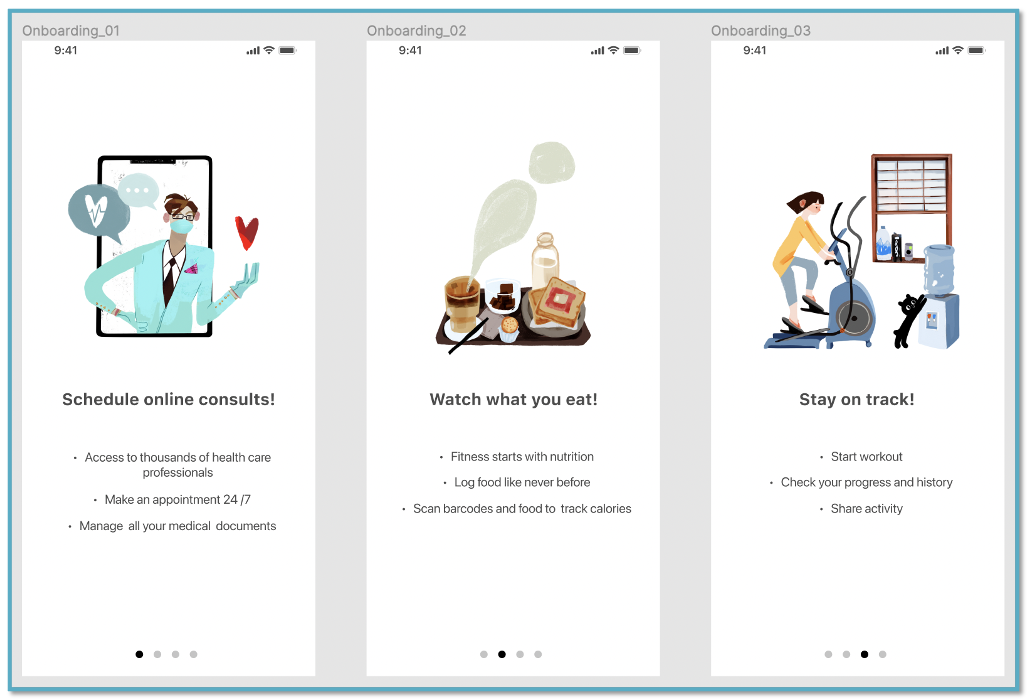
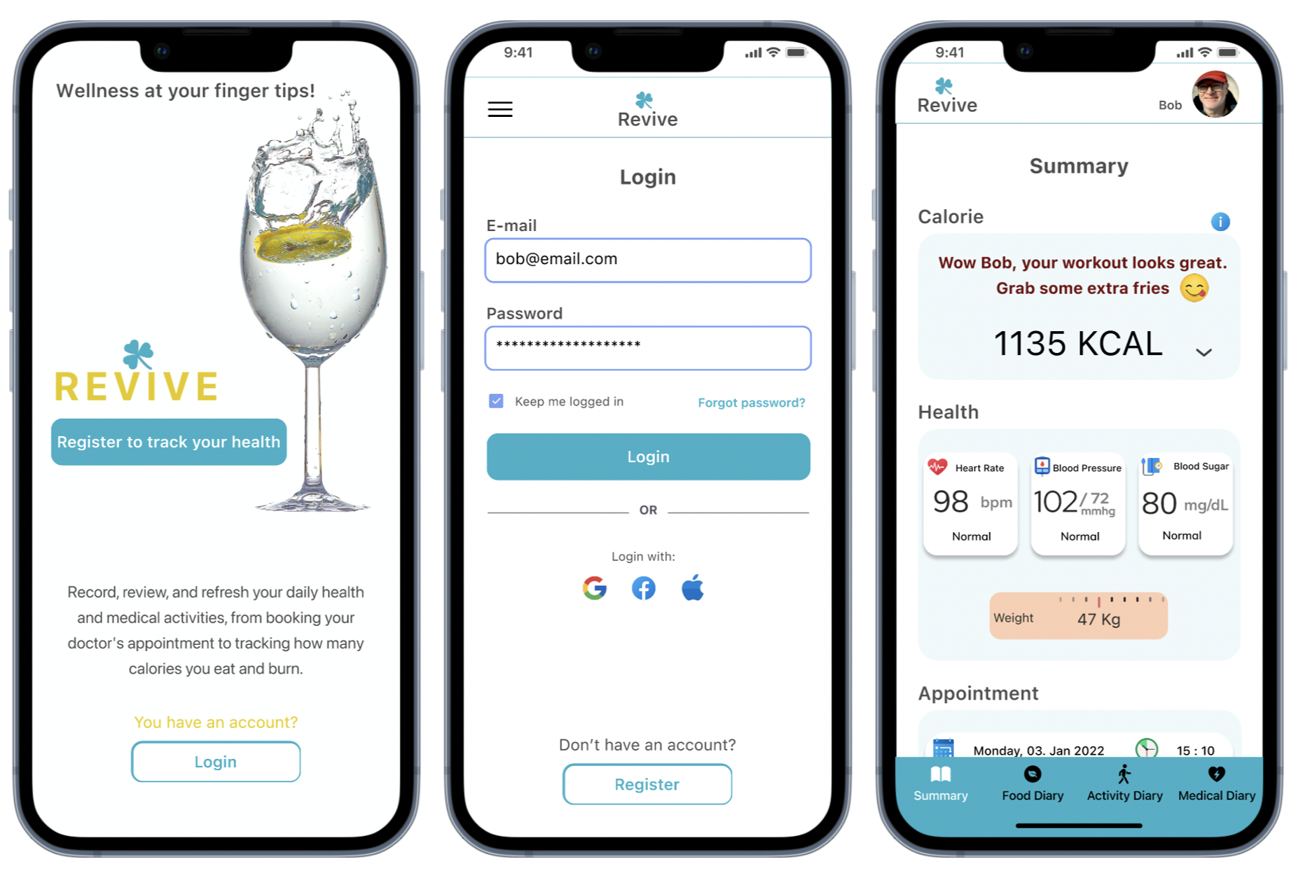
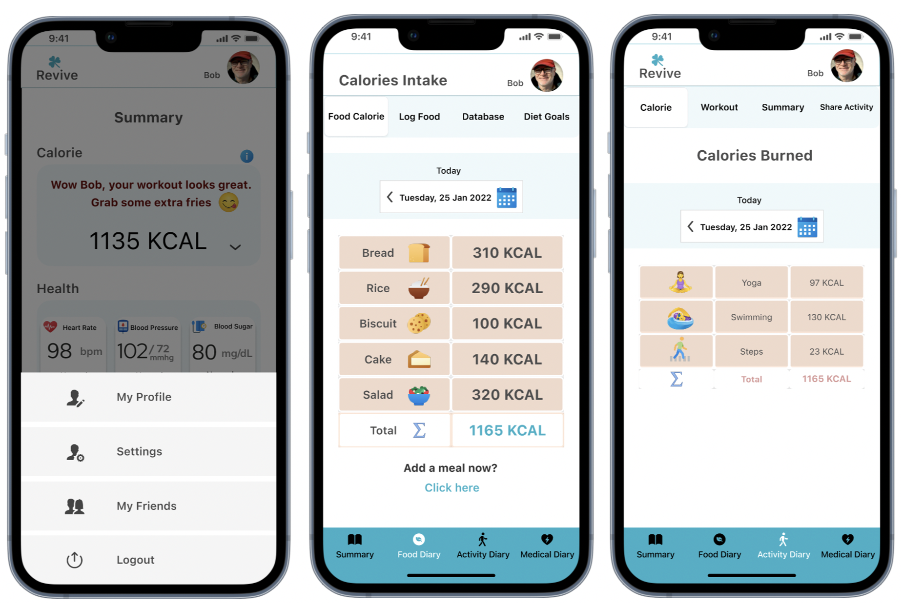
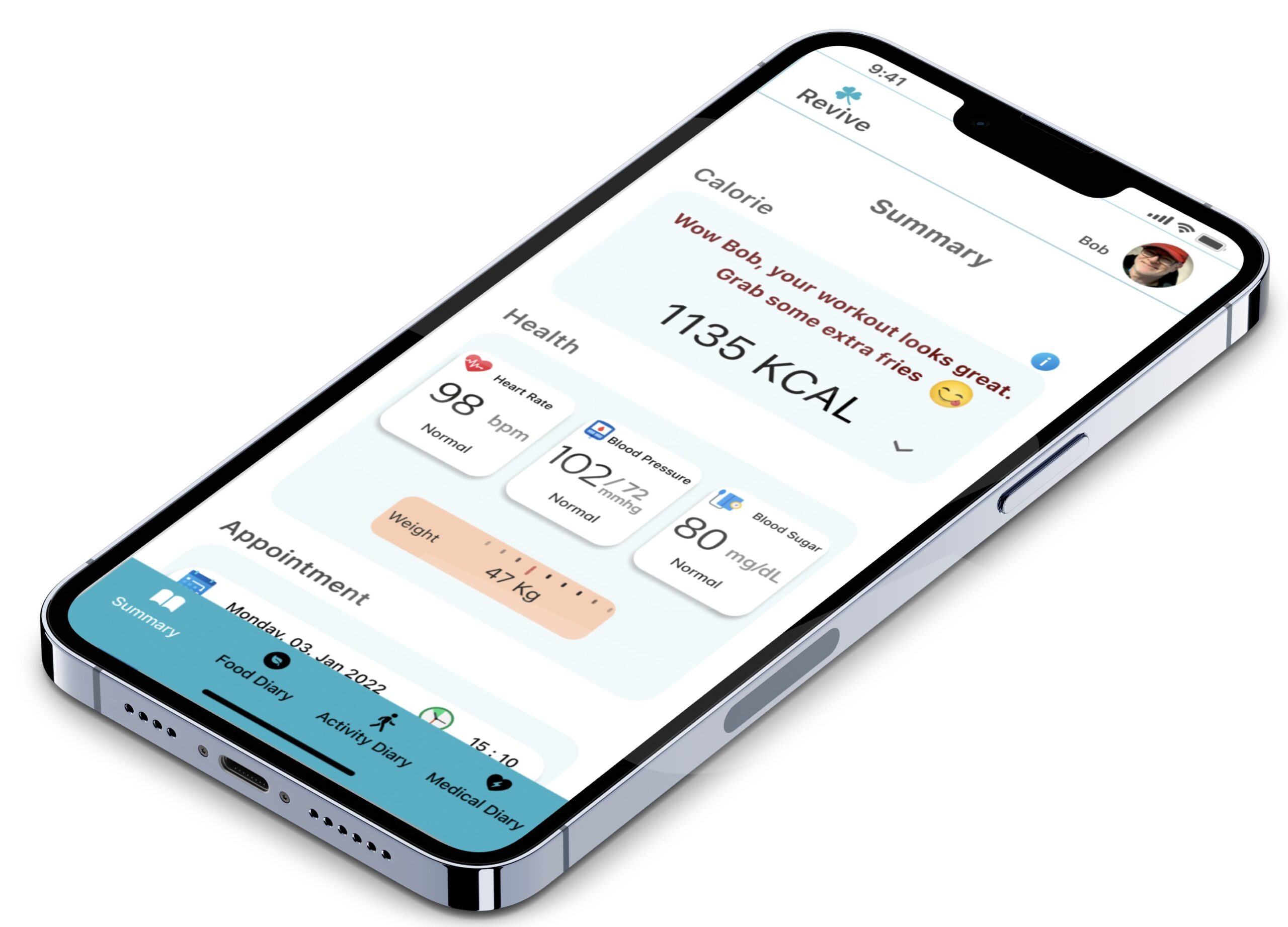
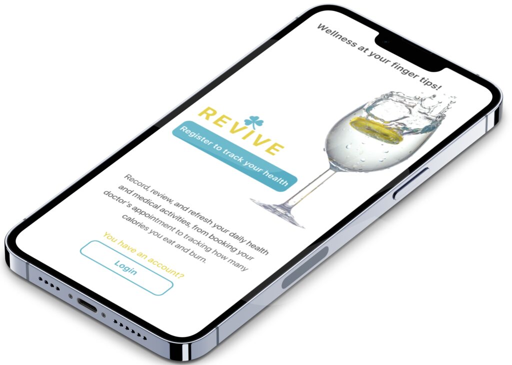
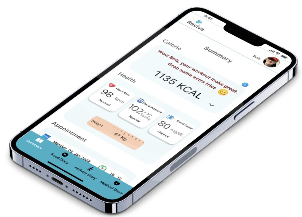
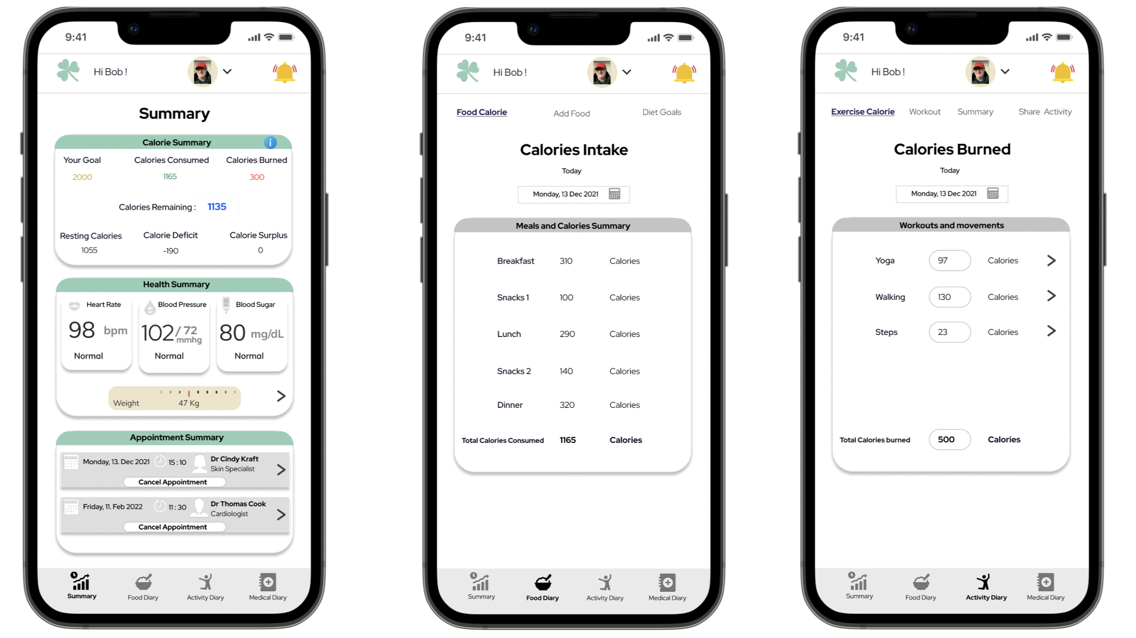
POLISHED UI OF MY APP